CREMIA is a Japanese soft cream brand launched by Nissei in 2013.
The name combines "Cream" and "Premium."
The brief was simple: build the finest soft cream that has never existed.
Standard soft cream runs at 5–8% butterfat.
CREMIA uses 25% fresh cream from Hokkaido, at 12.5% fat.
The goal wasn't density — it was redefining the baseline for smoothness.
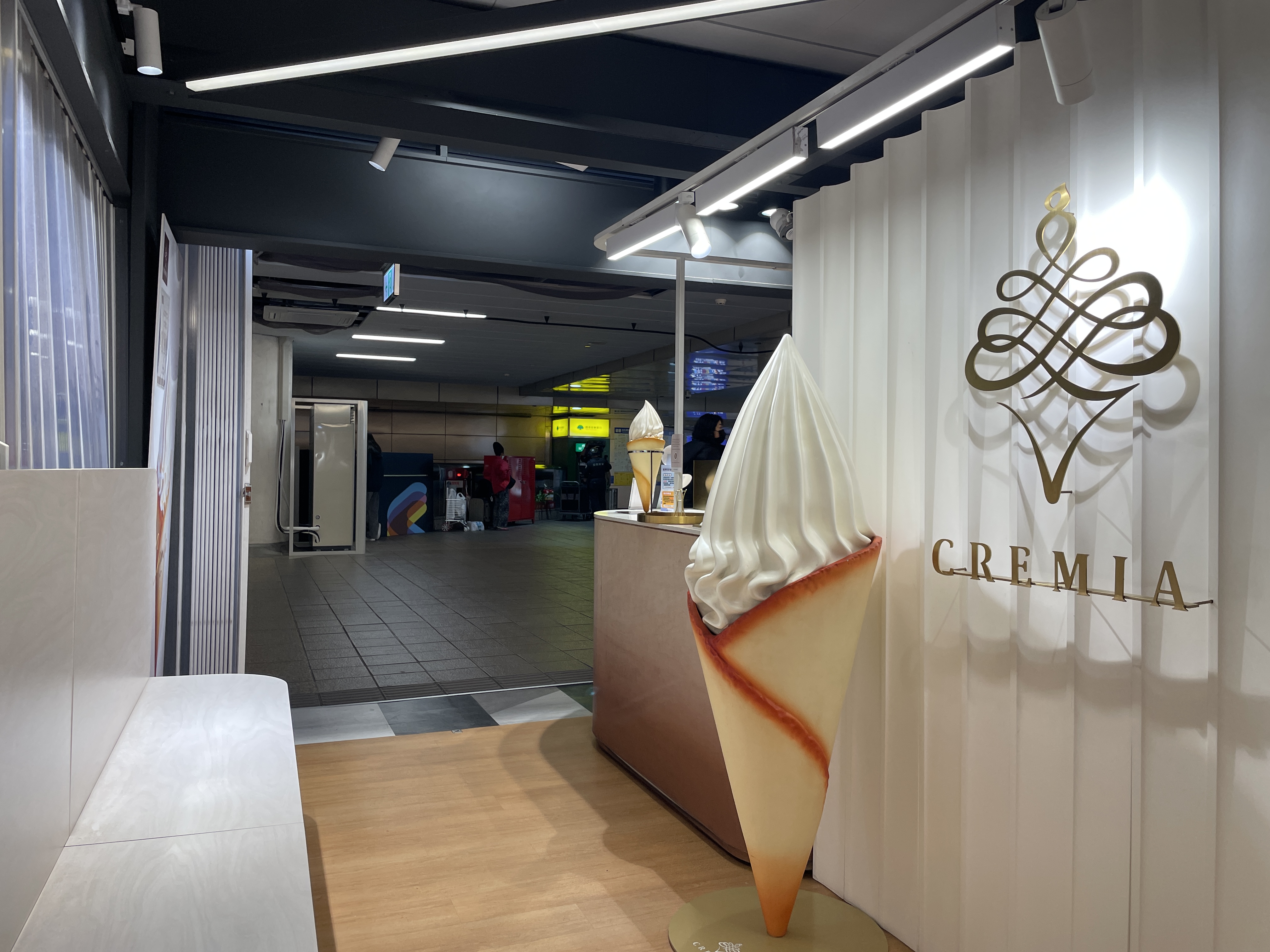
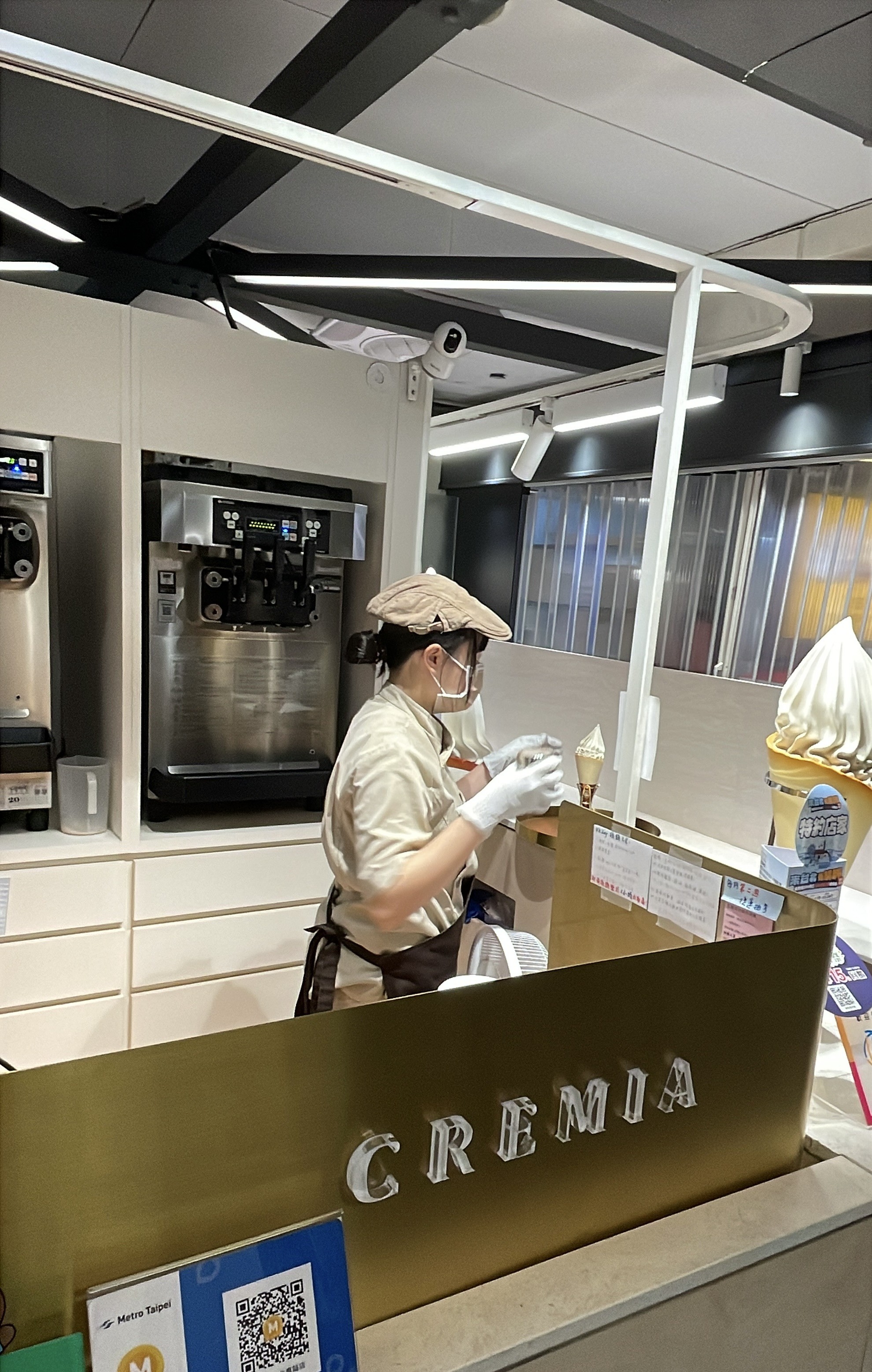
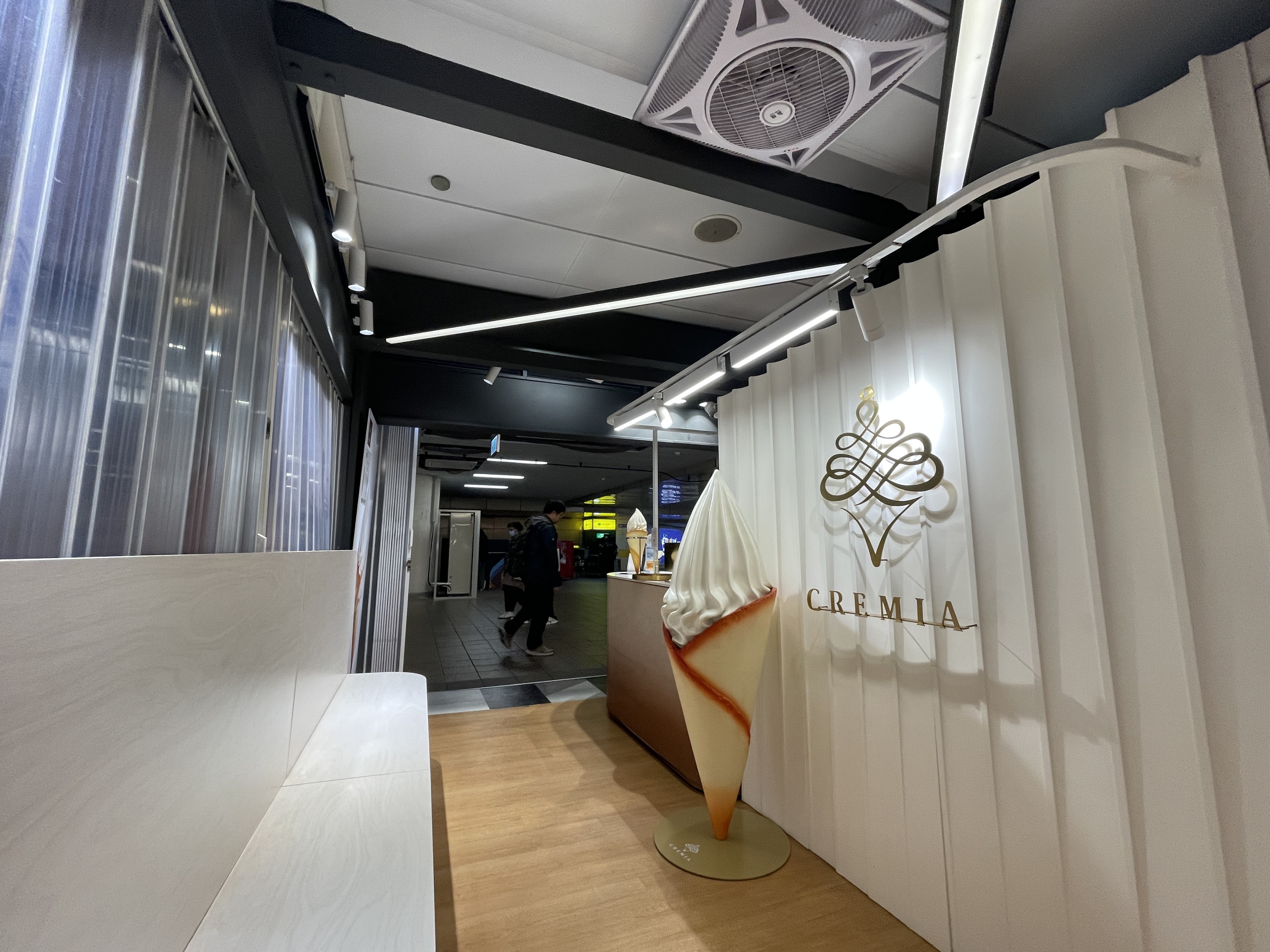
The Taipei outpost sits inside an MRT station.
The space is small.
The foot traffic is fast.
None of that changed what the brand decided to be.
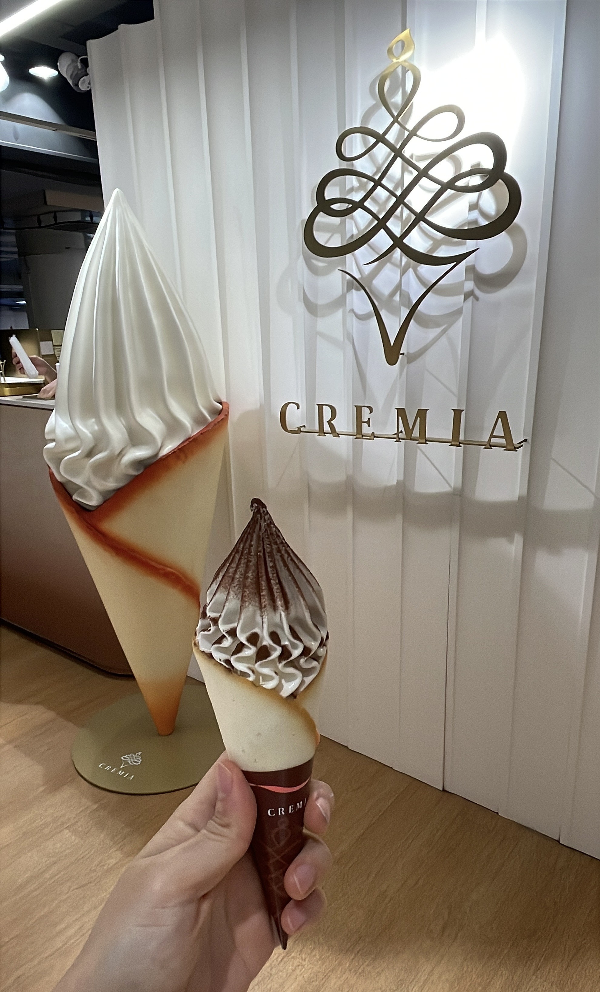
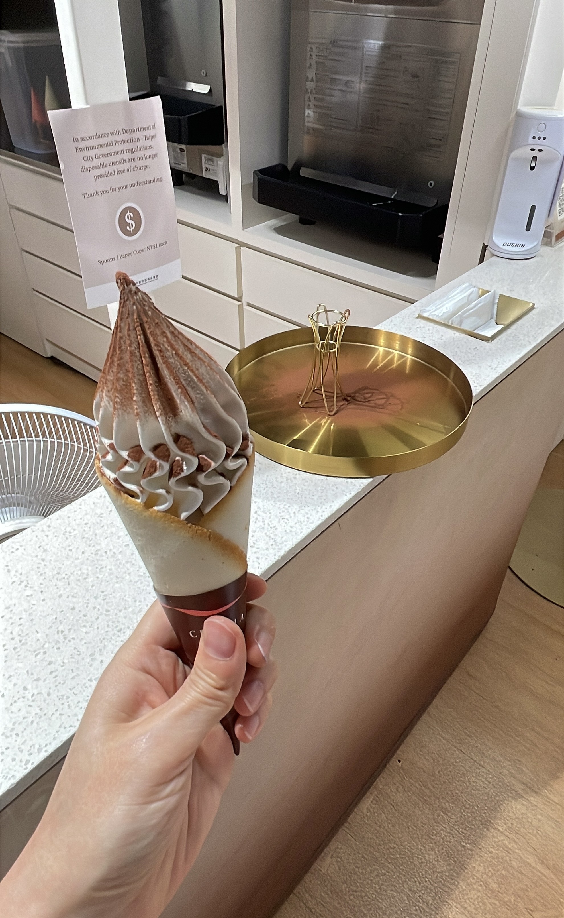
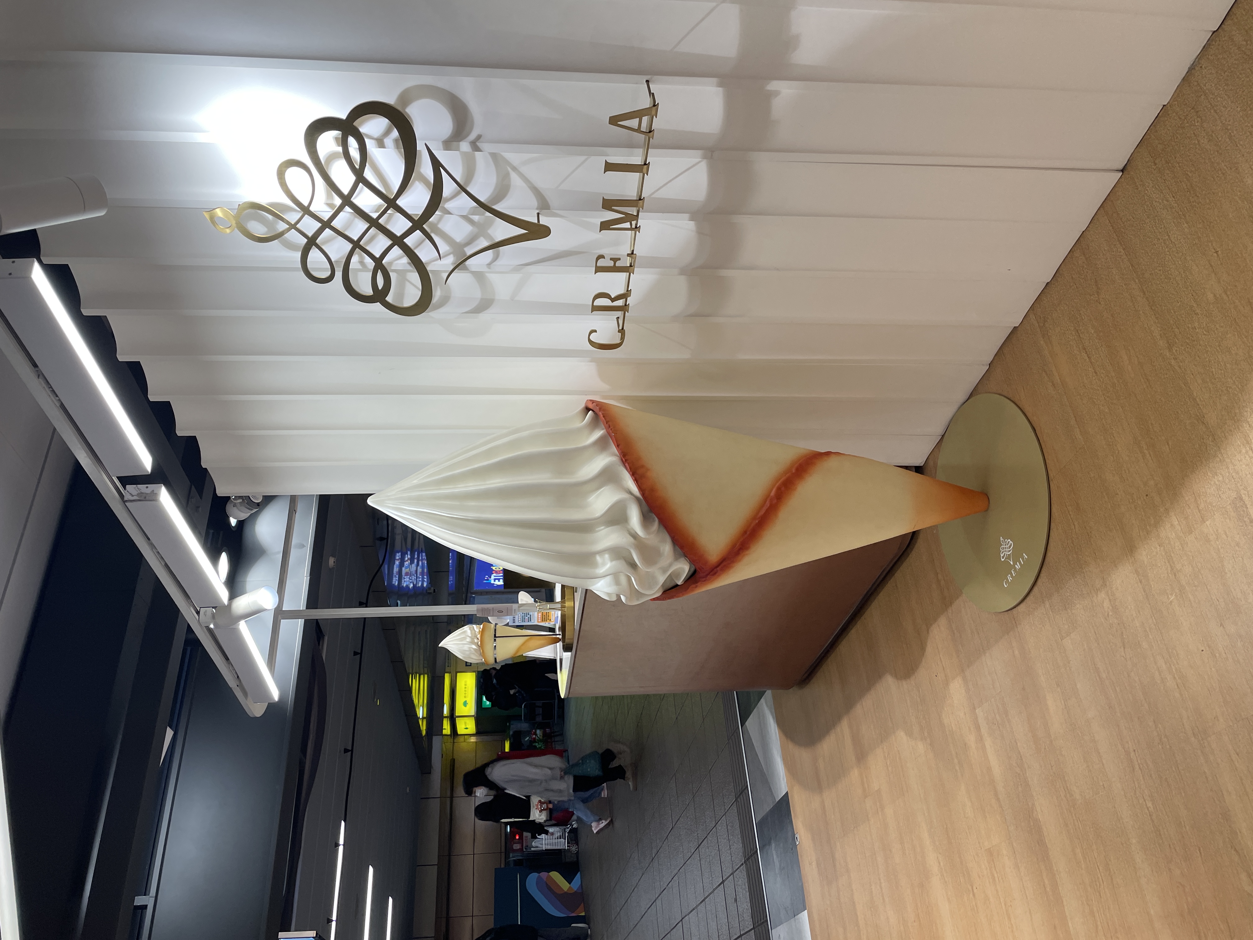
CREMIA developed its own cone — based on the French langue de chat —
specifically engineered to complement the texture of the cream.
The crisp wafer against the silk swirl is not an accident.
It is part of the product design.
When every element is considered, the product stops being a commodity.
It becomes an object.
Three flavors. Two cone options.
That is the entire menu.
The brevity is intentional — it removes decision fatigue and puts all attention on what follows.
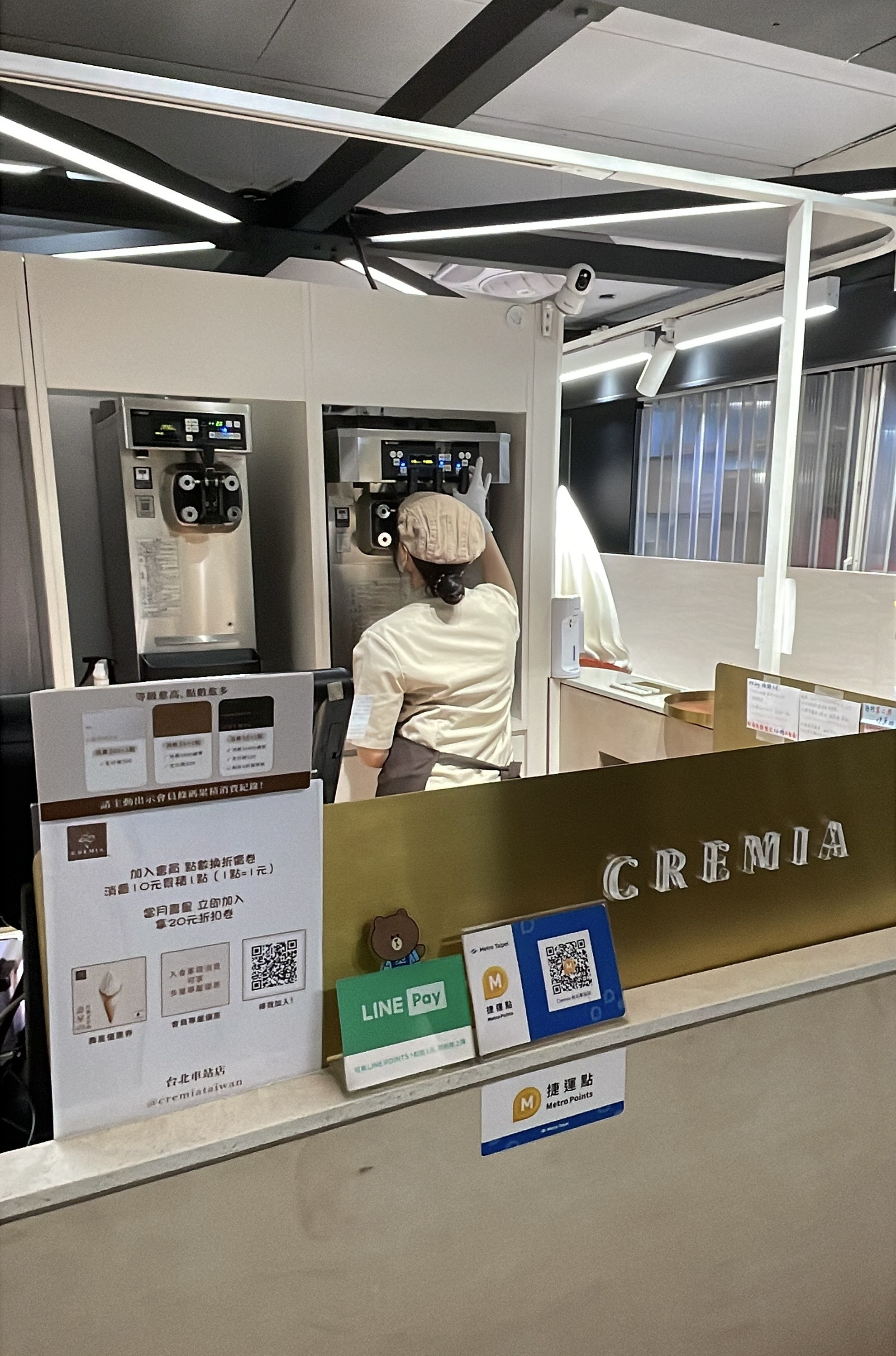
When the order is ready, the staff places the soft cream upright on a tray.
Cocoa powder is tapped over the top.
A small funnel is added alongside, so the cone can be lifted cleanly.
The whole transaction takes under five minutes.
But something about it feels considered.
The speed is there — the manner of handing it over is not.
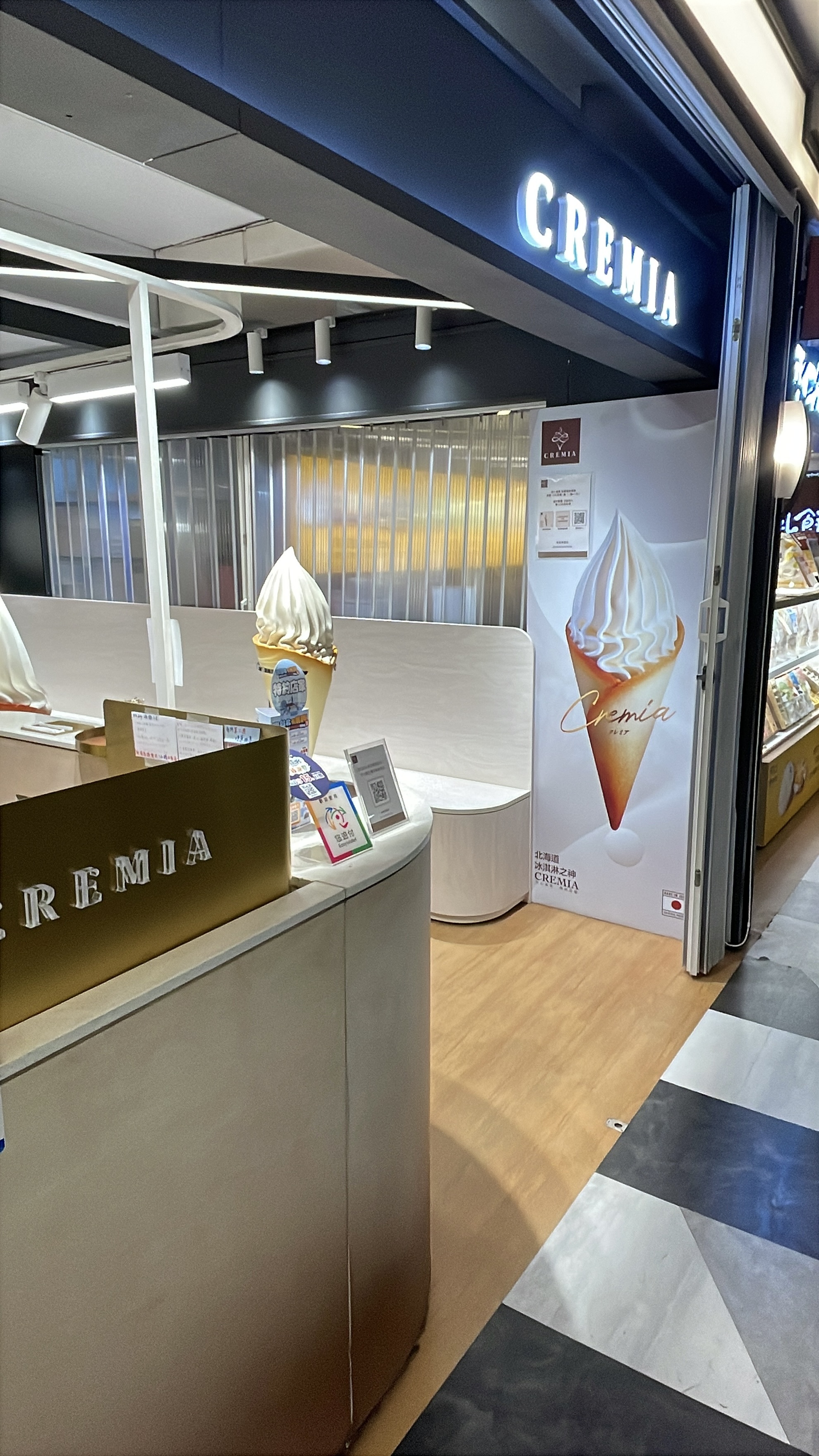
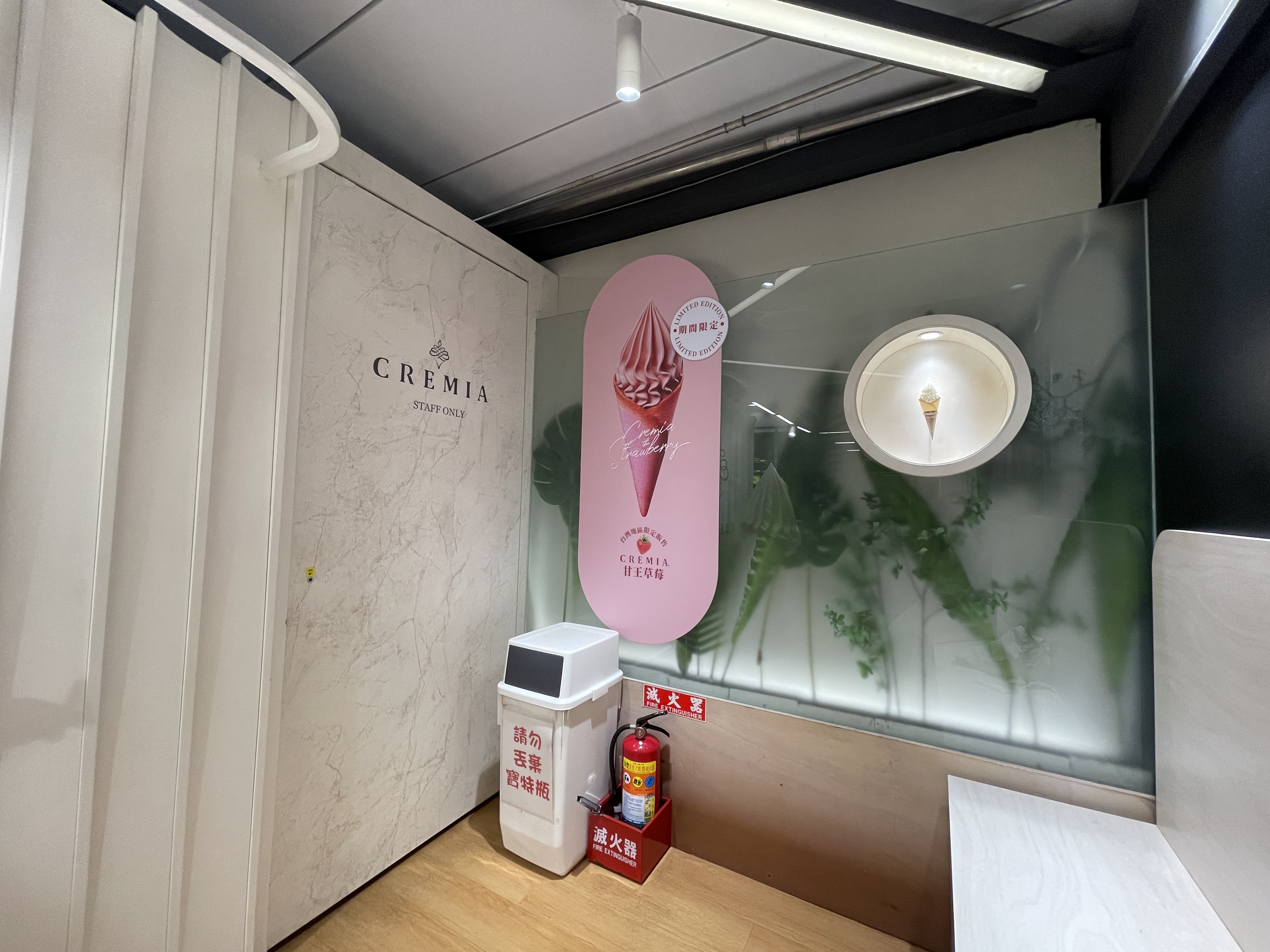
The space is small — a narrow unit beside a transit corridor.
There is no room for elaborate fixtures or layered décor.
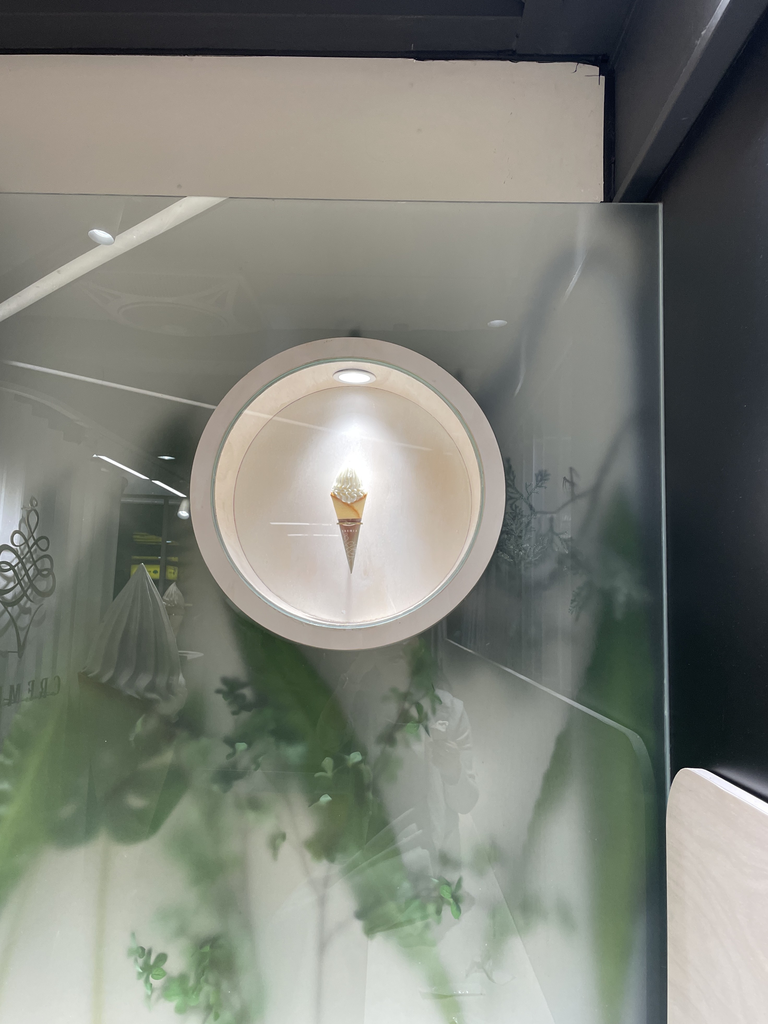
What CREMIA chose: white fluted wall panels, a single gold lettering logo.
No further explanation.
In a station full of competing signage, that restraint is what makes it readable.
The brand is legible before you've read a word.
There is seating along one side — not much, but enough.
You can take it and go, or stay for a few minutes.
The space is built for throughput, but it does not force urgency on you.
Building luxury inside a transit station is a constraint most brands avoid.
The footprint is small.
The dwell time is short.
The customer is moving.
CREMIA didn't soften the constraint.
It worked within it — and used every element it could control:
the quality of the cream, the ritual of the handover, the precision of a single gold logo.
Manner of delivery.
One logo.
It was ice cream. But it had dignity.