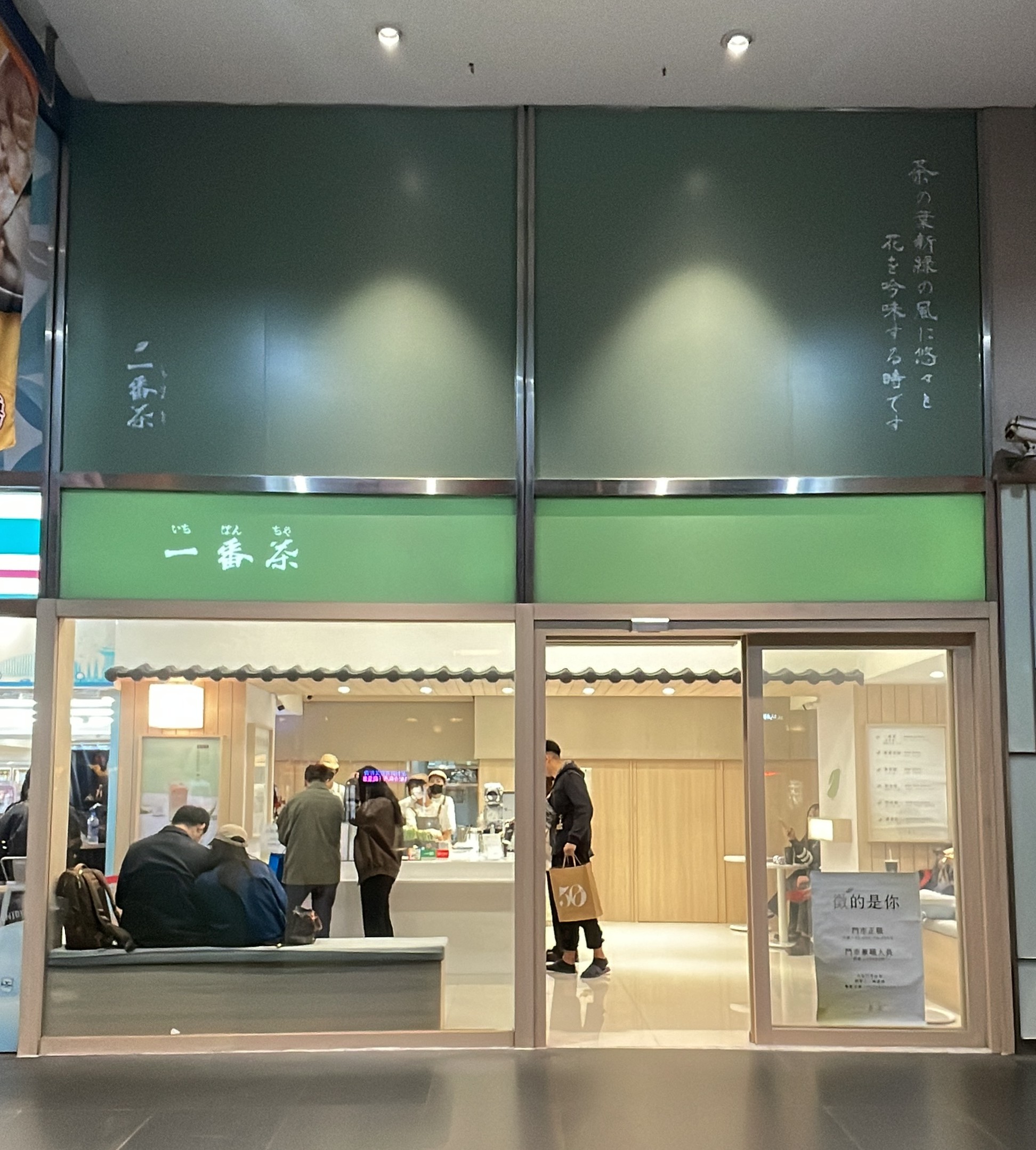
Walking down a street in Taipei. Stopped.
White, wood, a soft green.
Nothing striking, no bold color demanding attention.
And yet something made me look back.
A sense of order.
A feeling that something here had been finished — not decorated, finished.
That feeling stopped me before I'd read the name.
I wanted to go in before I knew what it was.
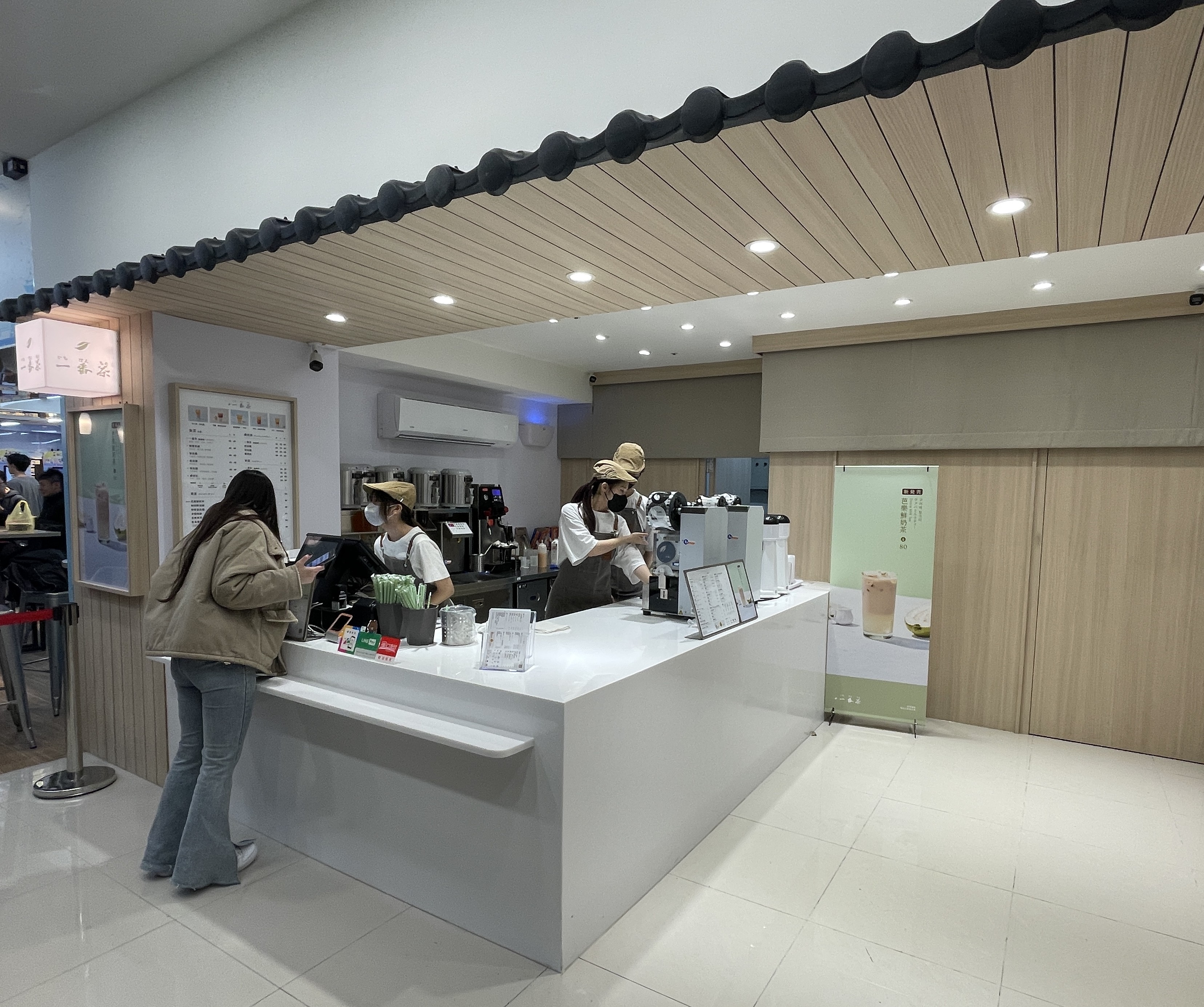
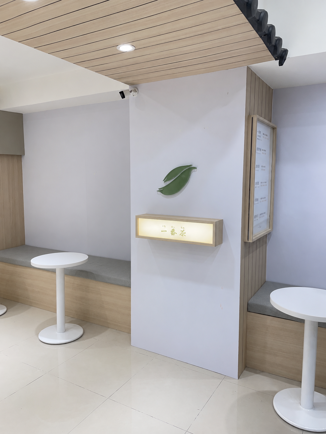
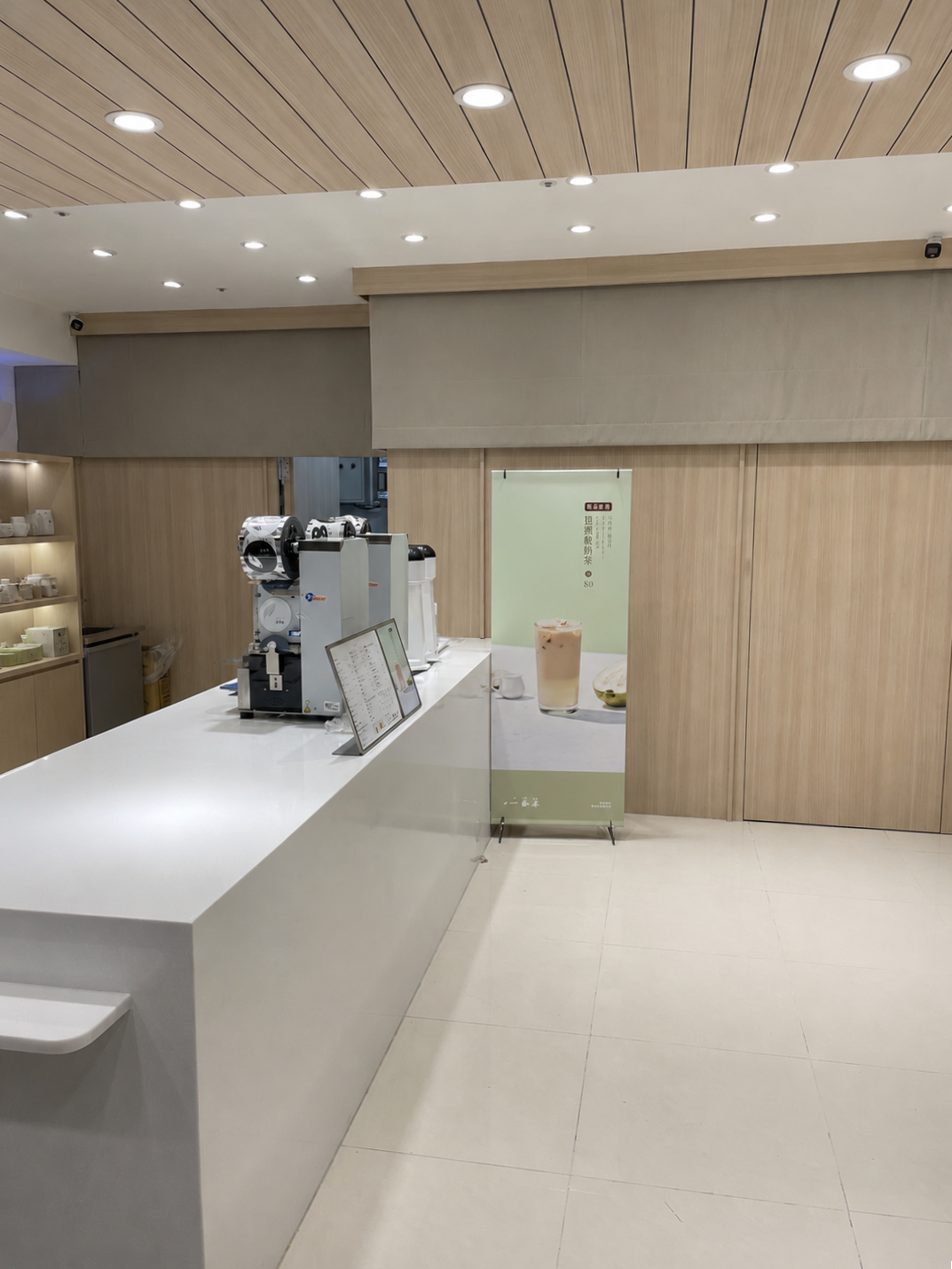
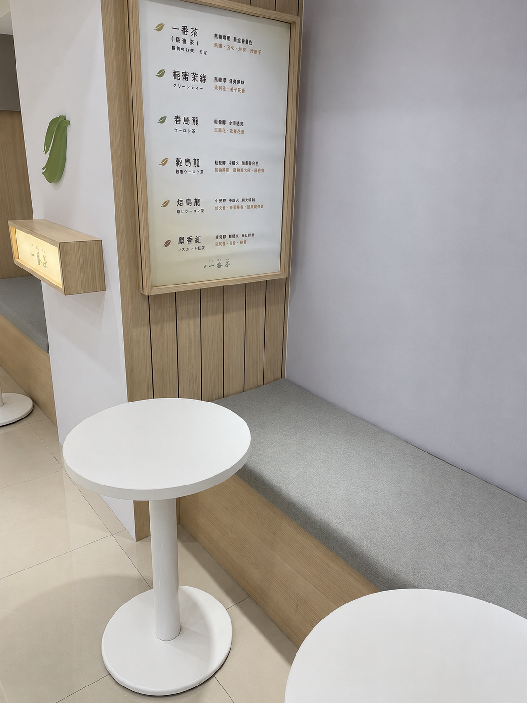
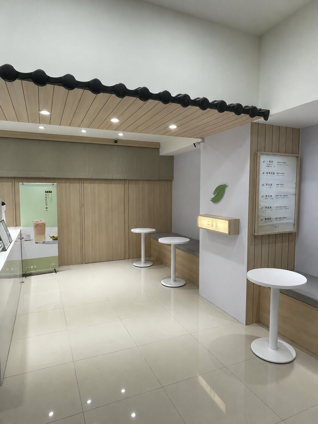
Inside, the same language continues.
White walls, wood panels, porcelain tile underfoot.
No material fights for attention.
Every element points in the same direction.
The counter is white. The lighting is warm.
The space speaks quietly.
This is a place for tea.
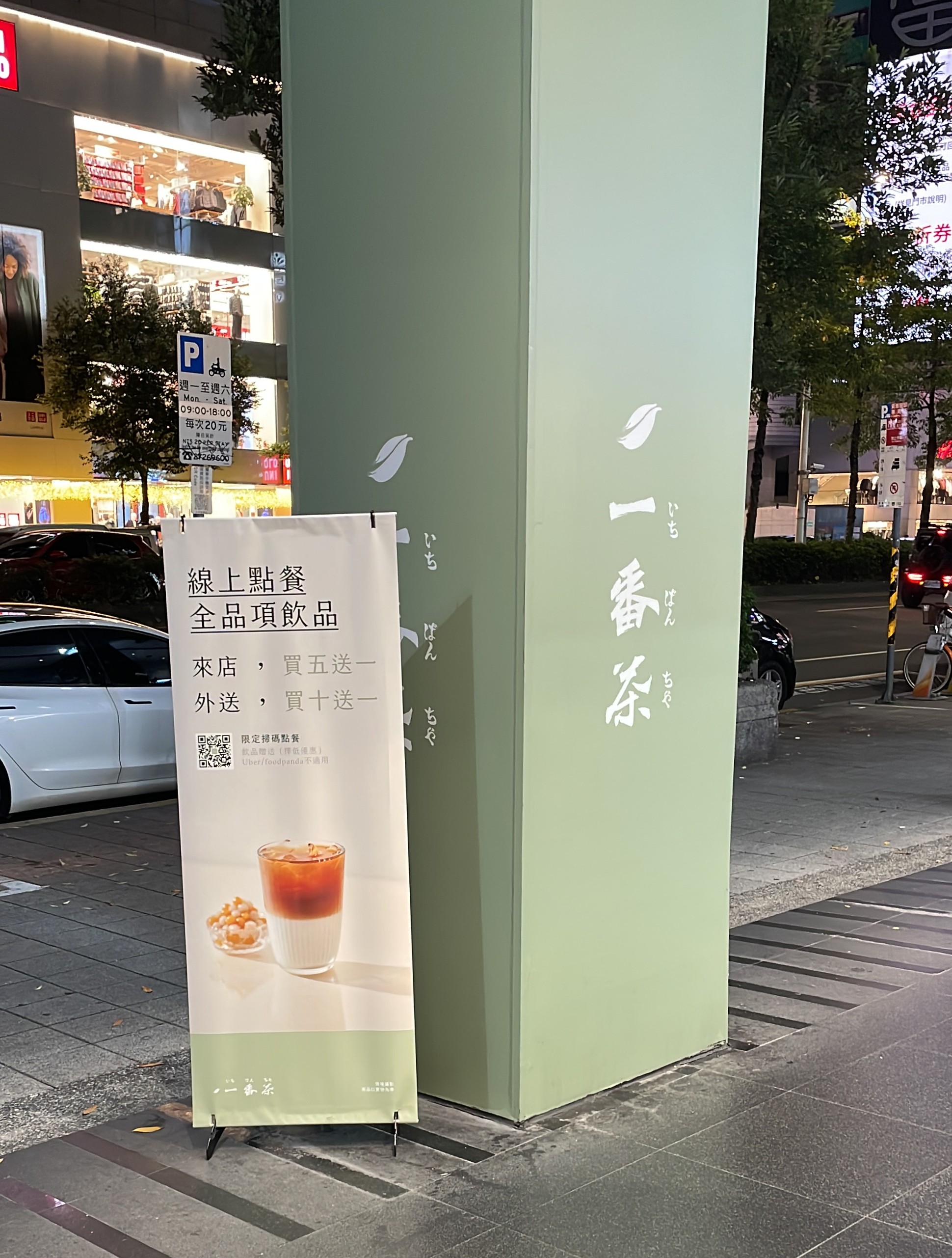
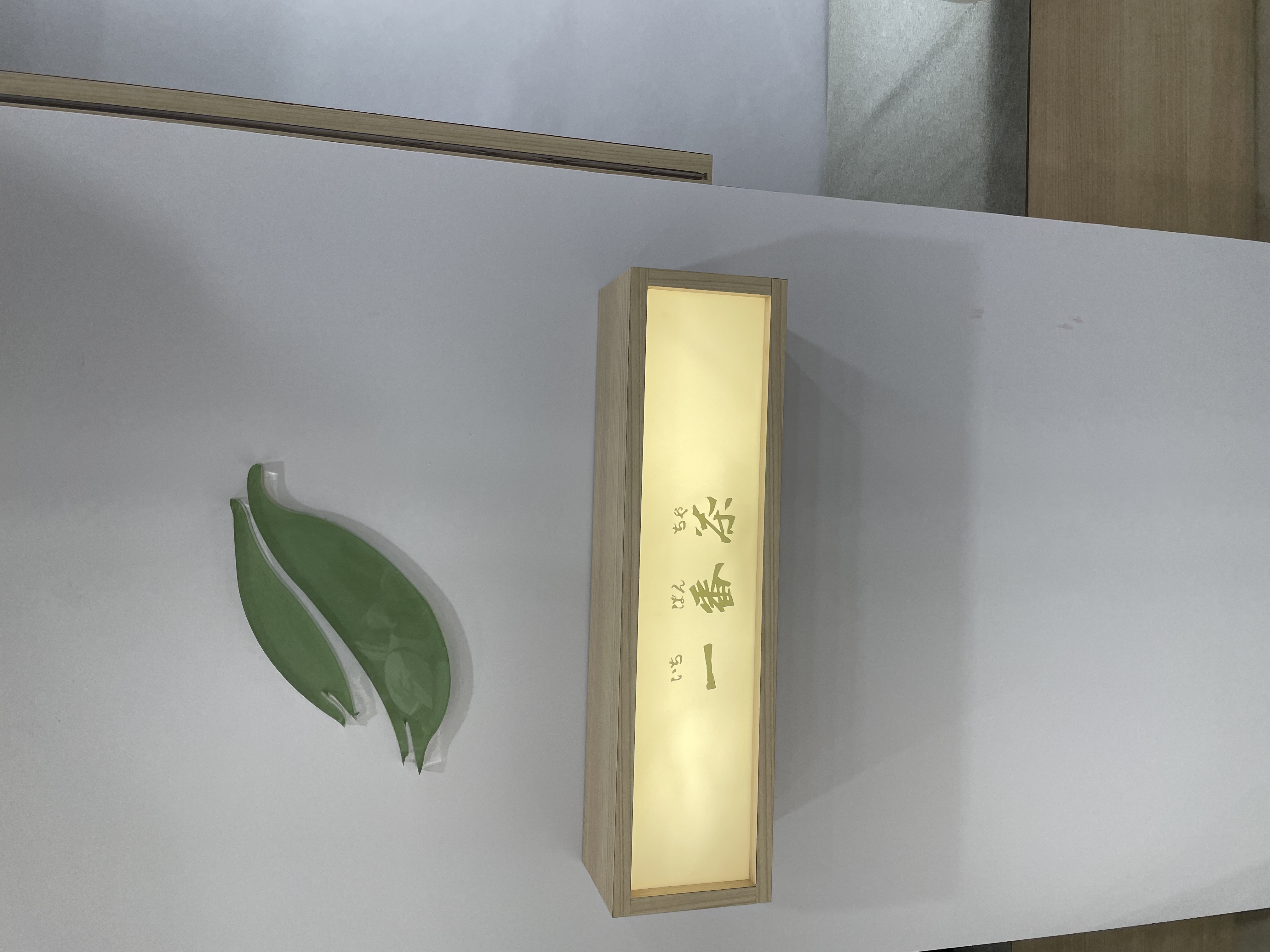
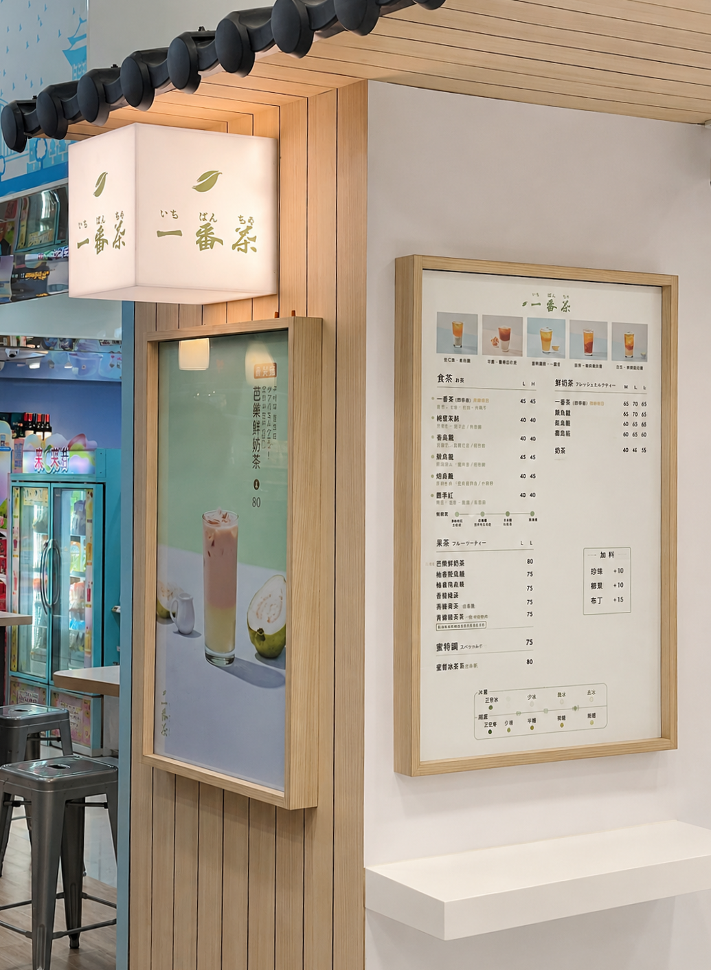
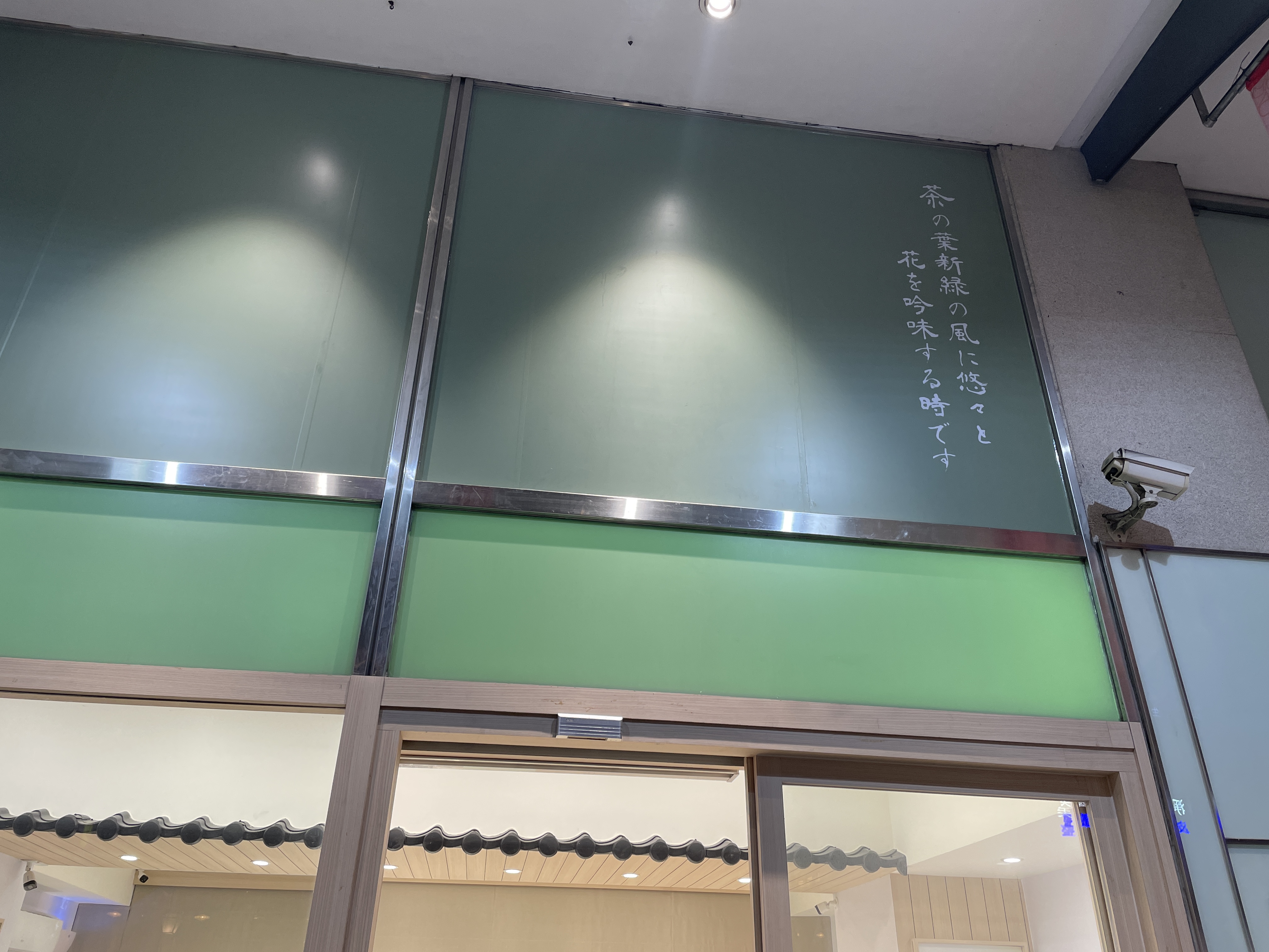
On the wall: a green leaf logo. 一番茶.
The first tea harvest — the most delicate picking of the season,
pulled at the first moment of spring.
That meaning is compressed into a single shape.
Nothing needs to be explained.
One leaf summarizes the entire brand.
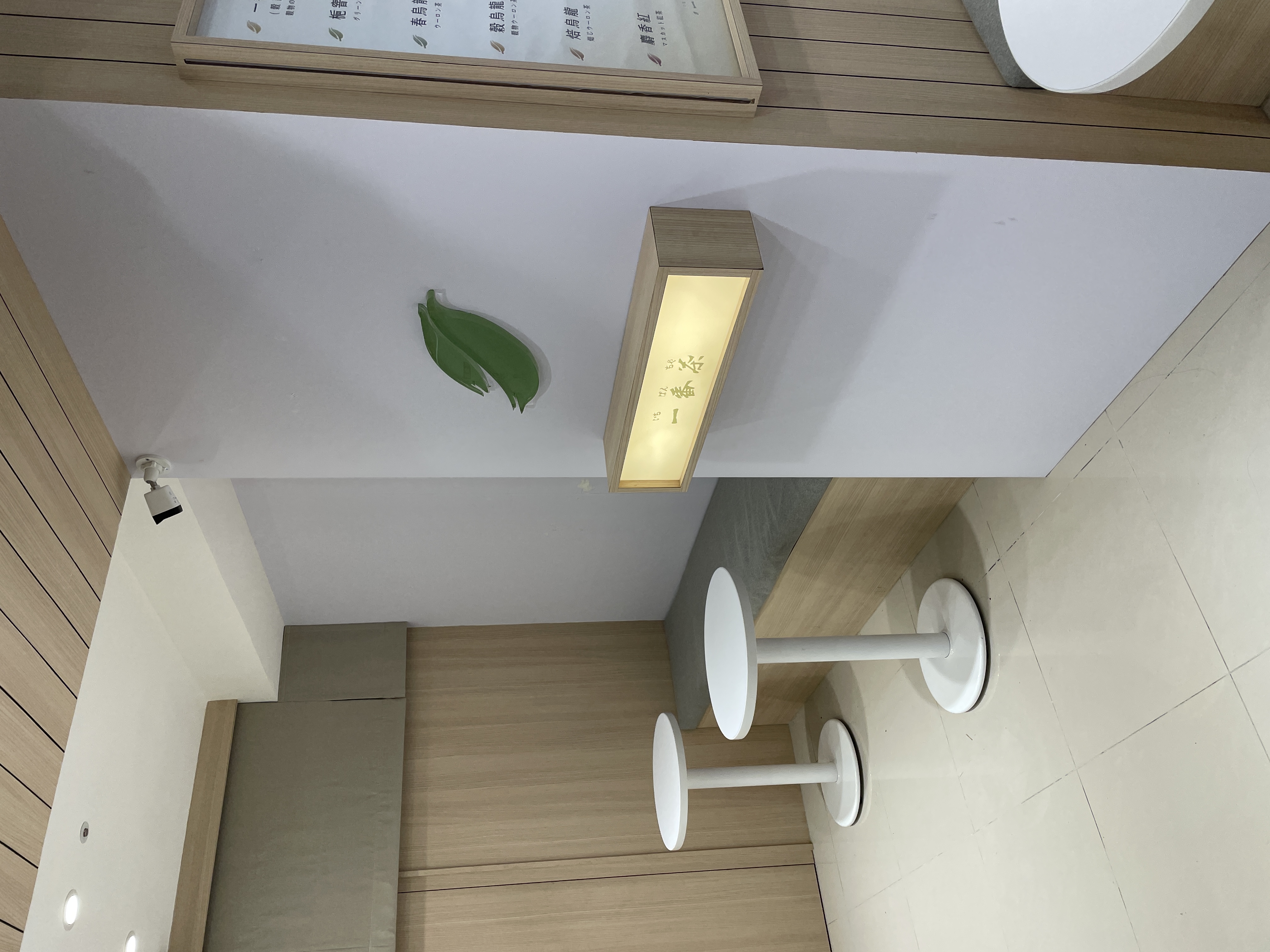
Look up: a wave pattern runs across the plaster.
It references kawara (瓦) — traditional Japanese roof tiles.
The brand name is いちばんちゃ, Japanese.
The aesthetic language is Japanese. The material choices are Japanese.
This is a Taiwanese brand that chose,
from the very first decision to the last detail,
to speak entirely in Japanese.
And that choice holds, without exception, across the whole space.
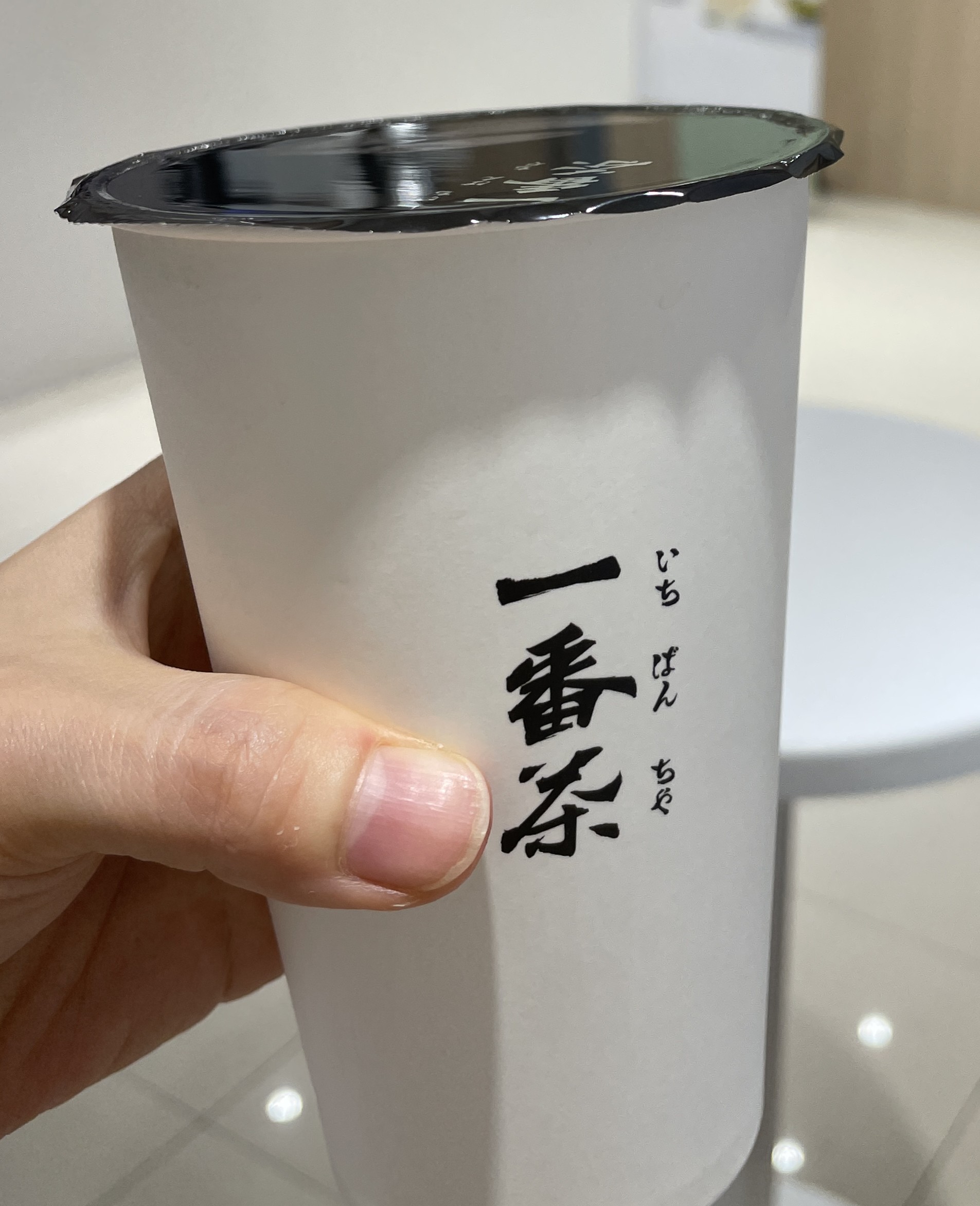
Ordered. Received the cup.
White body, calligraphy logo, green straw, matching sleeve.
Same color. Same weight. Same intent.
What the space was saying, the cup was saying too.
The packaging closed the loop — nothing broke.
That continuity is where the brand's strength lives.
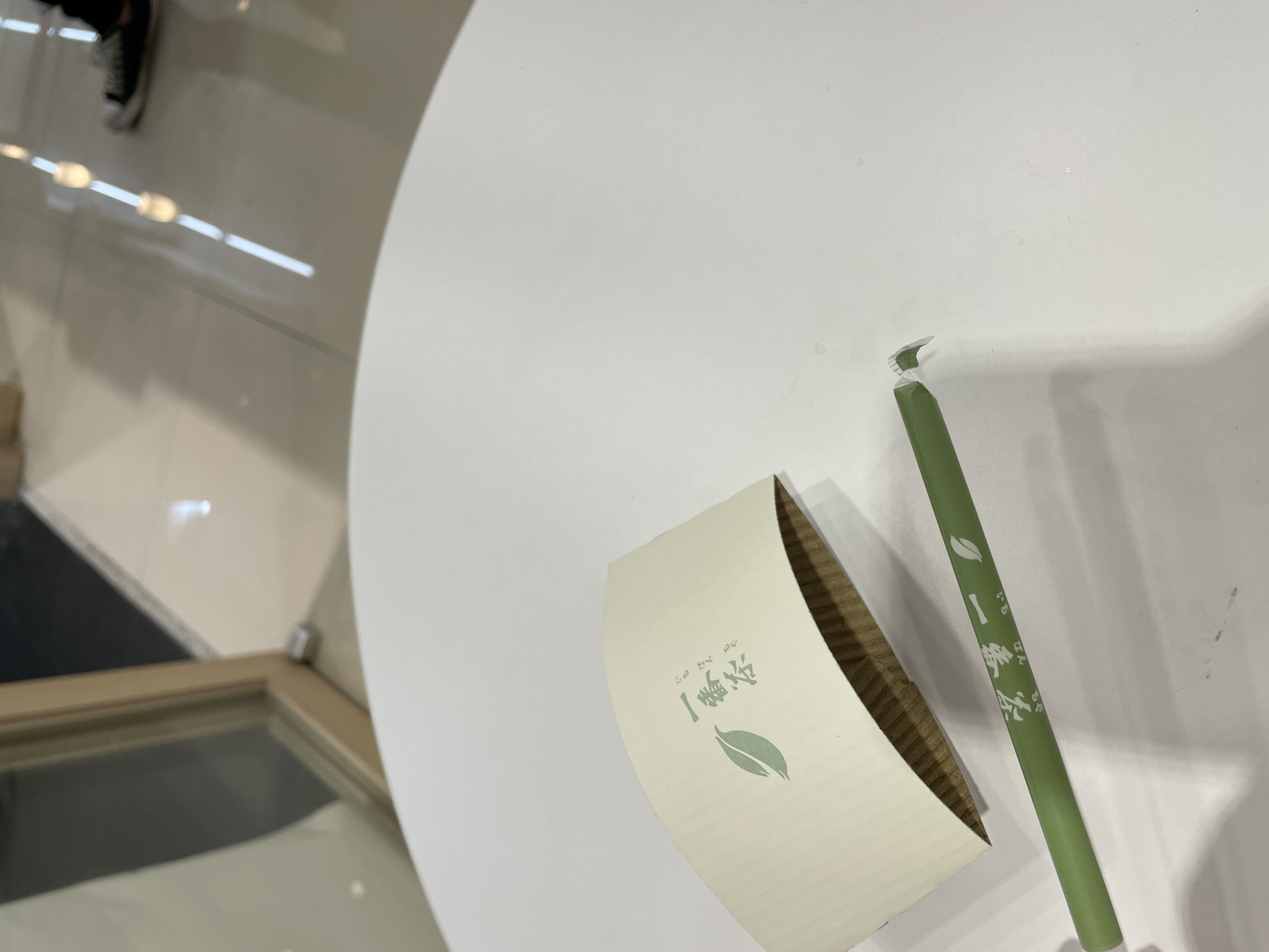
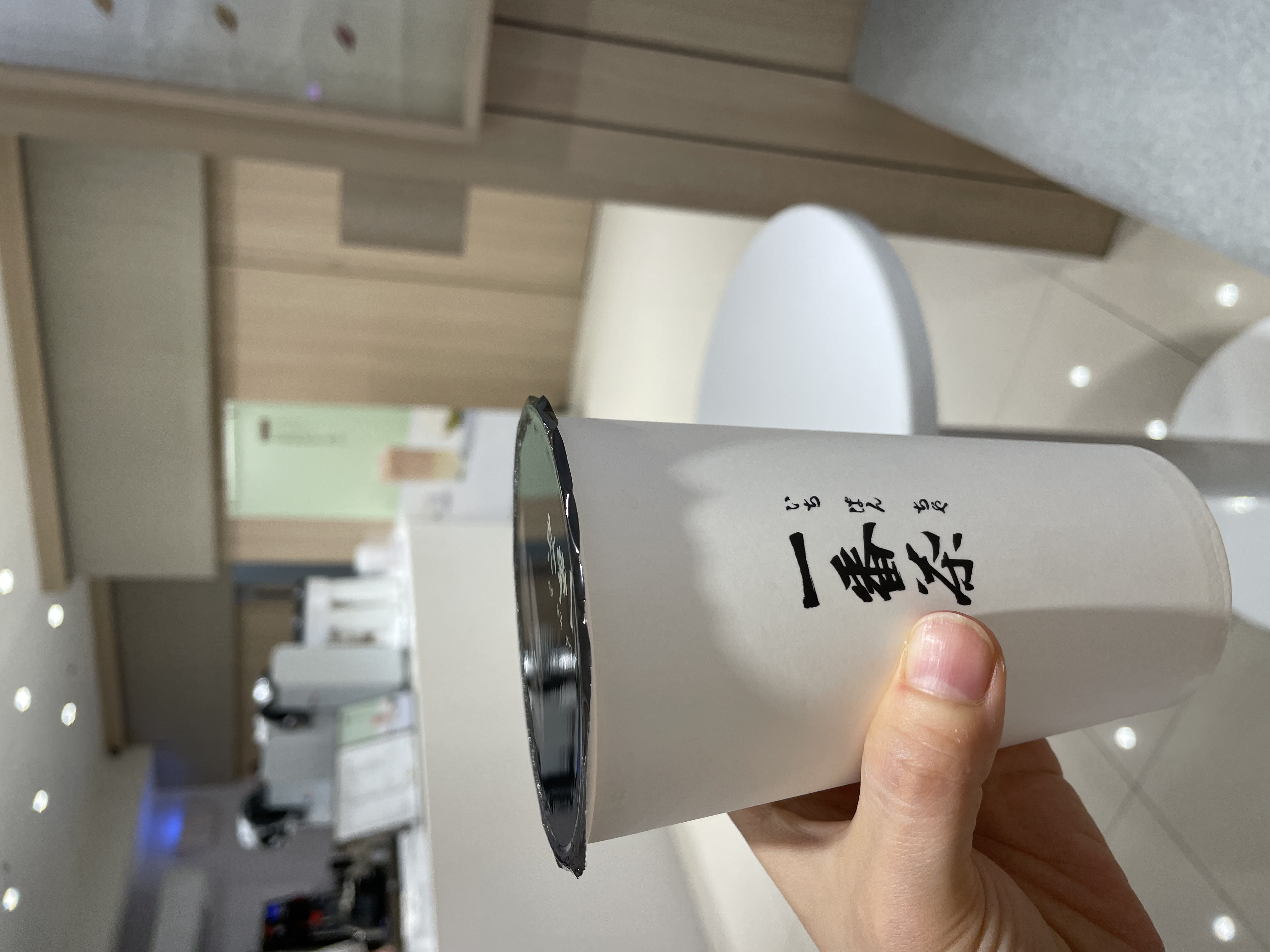
Nothing broke the system — that was the brand's strength.
The calligraphy isn't only on the cup.
The same brushwork appears on the exterior wall of the facade.
Strokes that move like a brush. Ink that spreads at the edge.
Calligraphy is not a font choice.
It isn't selecting from a menu of typefaces.
It's writing by hand — and the hand leaves its trace.
On the wall, on the cup, on the packaging —
the same stroke repeats through the space.
Each instance isn't just a logo.
It reads as something made, something placed with intention.
No heavy decoration, but the space feels full.
The calligraphy is carrying the atmosphere.
This is a space that sells tea —
but more precisely, it sells an image: restraint.
The name, the color, the material, the graphic, the cup.
Everything points in the same direction.
Branding may not be the work of adding new things.
It may be the work of repeating one thing, clearly, without breaking it.
You don't need to be loud.
Consistency draws the eye. Consistency stays in memory.
You don't need to be loud to be remembered.