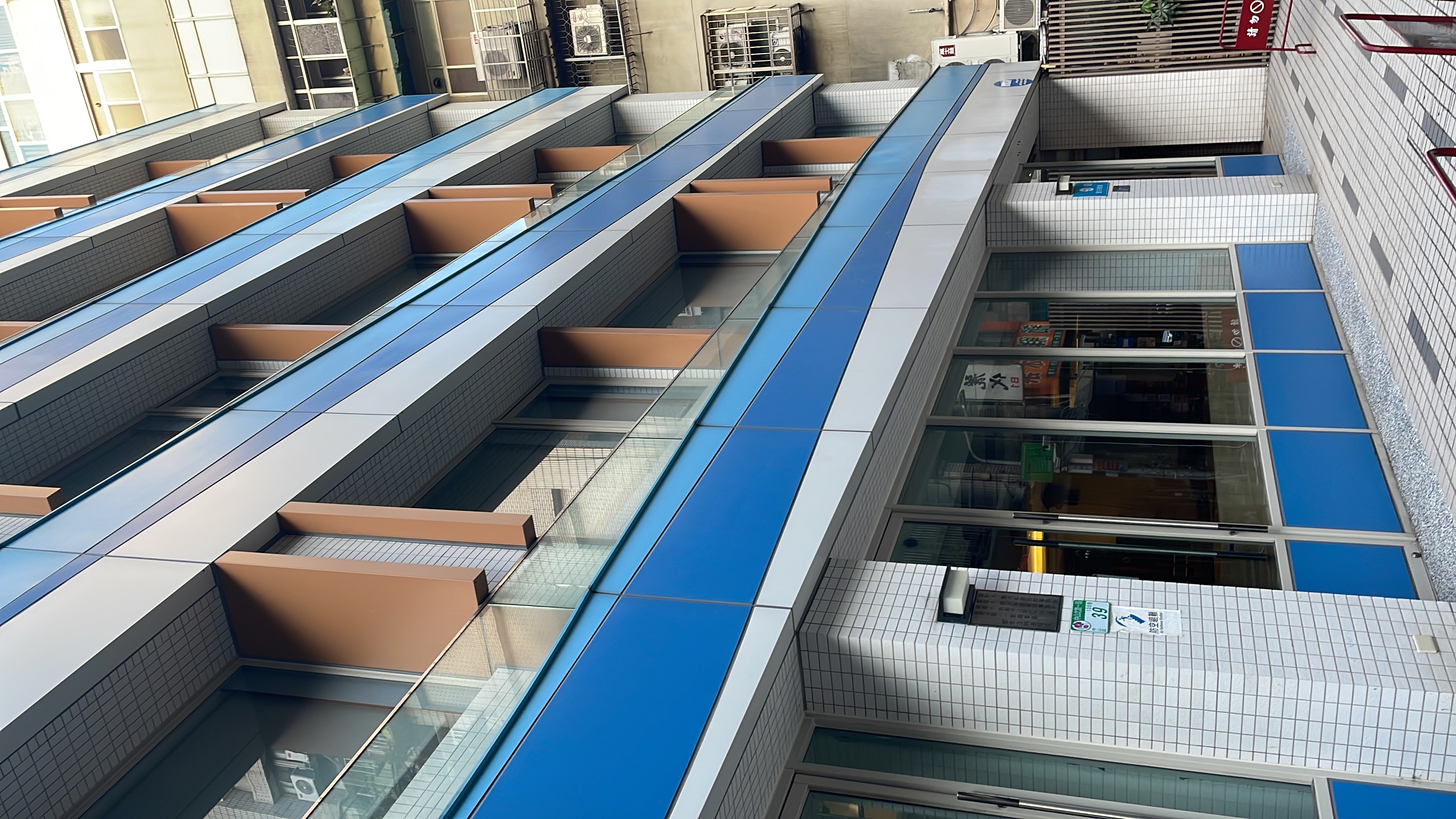
Brand color as architecture
Most hotels announce themselves with a sign. PANCO announces itself with an entire building.
The cobalt blue aluminium facade wraps the structure from top to bottom — the same exact blue as the circular logo mounted at the entrance. This is not a color choice. It is a spatial declaration: brand identity extended into architecture.
In a street lined with weathered buildings, there is no guessing. You know immediately. That kind of visual clarity is not an accident — it is a positioning strategy built into the walls themselves.
The contrast is intentional and immediate.
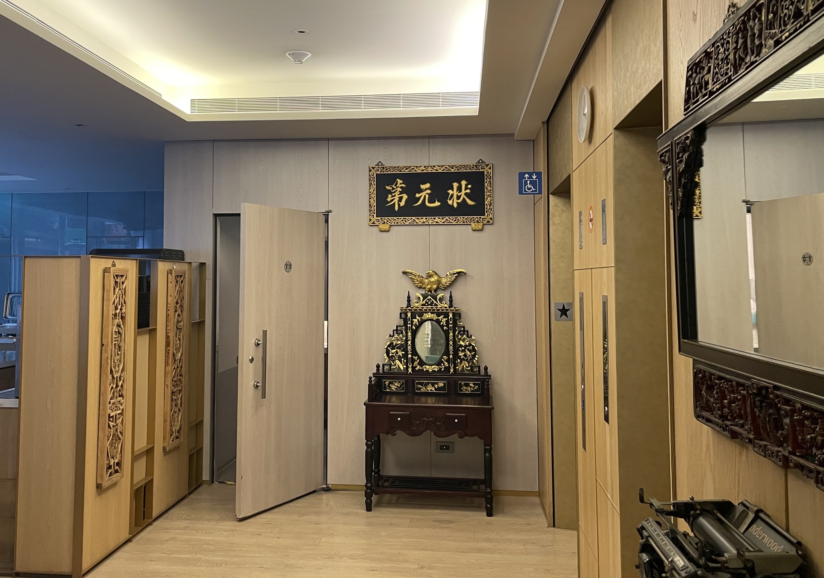
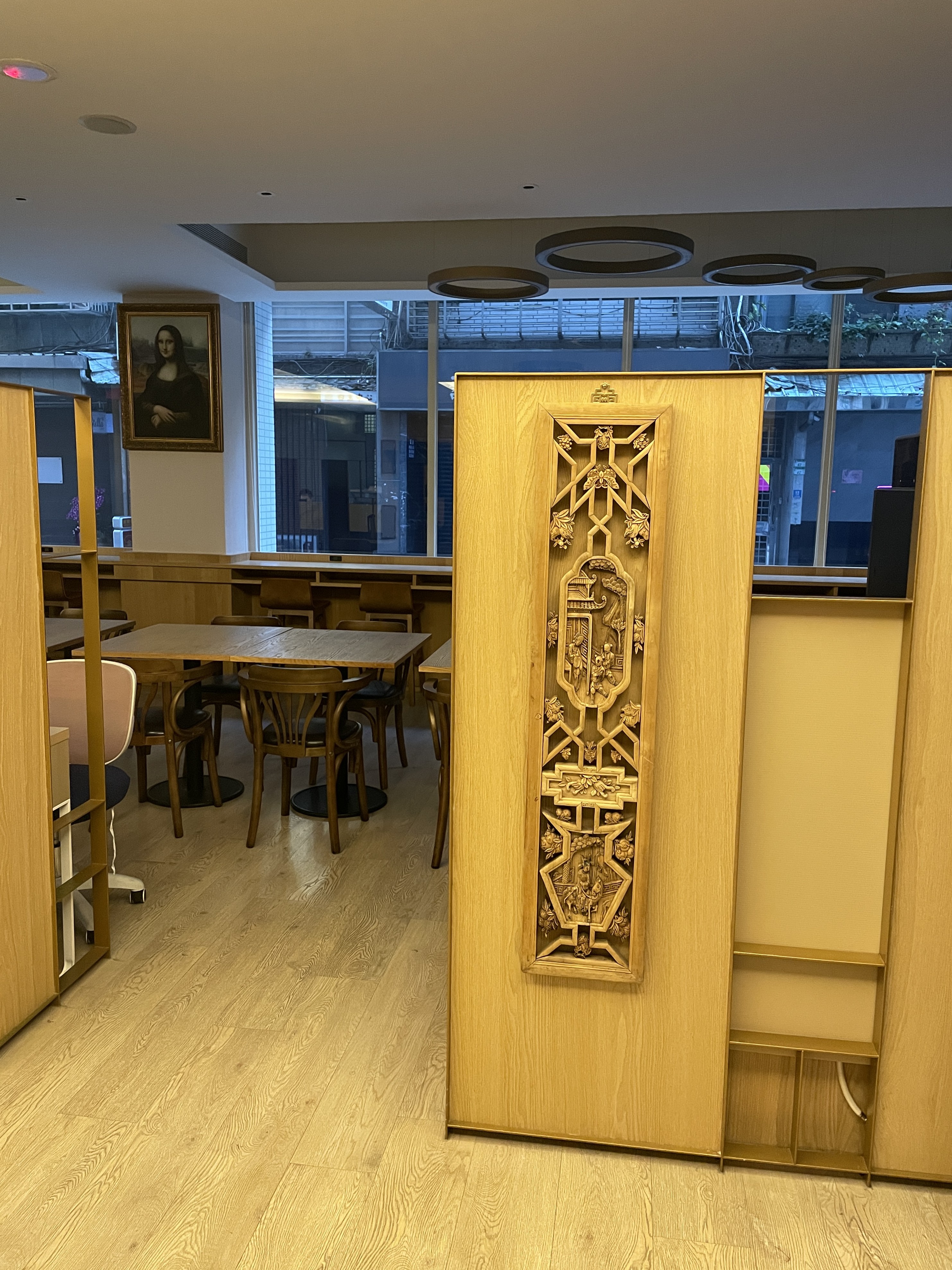
Where the exterior is sharp and contemporary, the lobby is layered with heritage — a gold Chinese inscription above the entrance, an antique console in dark lacquer, and an intricately carved wooden screen that divides the space. These are not decorative gestures. The carved pattern is drawn from traditional Chinese woodworking craft, a quiet acknowledgment that this building stands in Taipei, not anywhere else.
The outside says: we are here. The inside says: we know where we come from.
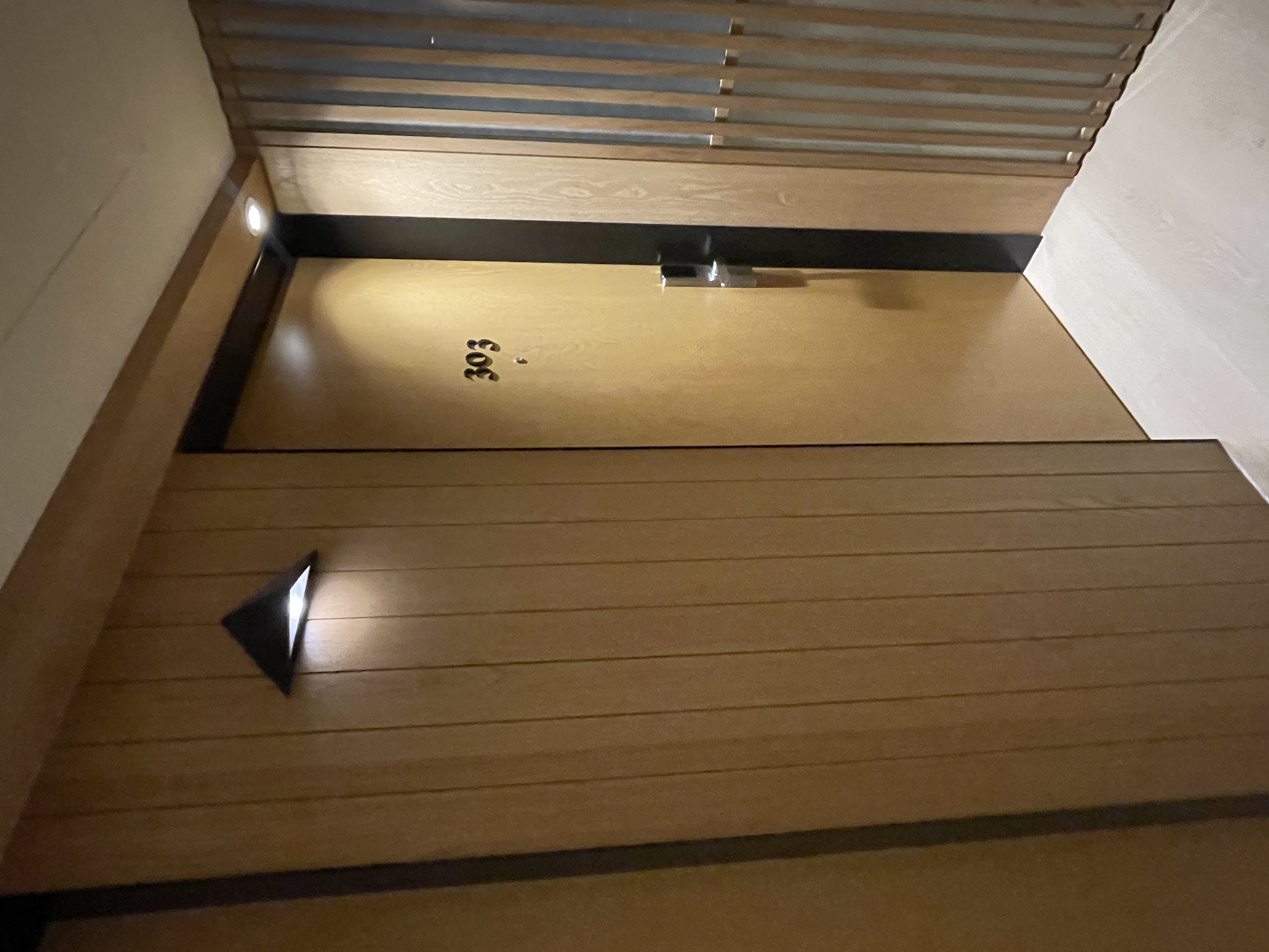
The corridor is lined with warm timber panels. At the far end, a single triangular wall sconce — stepped, minimal, precise.
Nothing competes with it. That restraint is a design decision. When a space trusts a single element to carry the moment, it signals confidence in the overall composition.
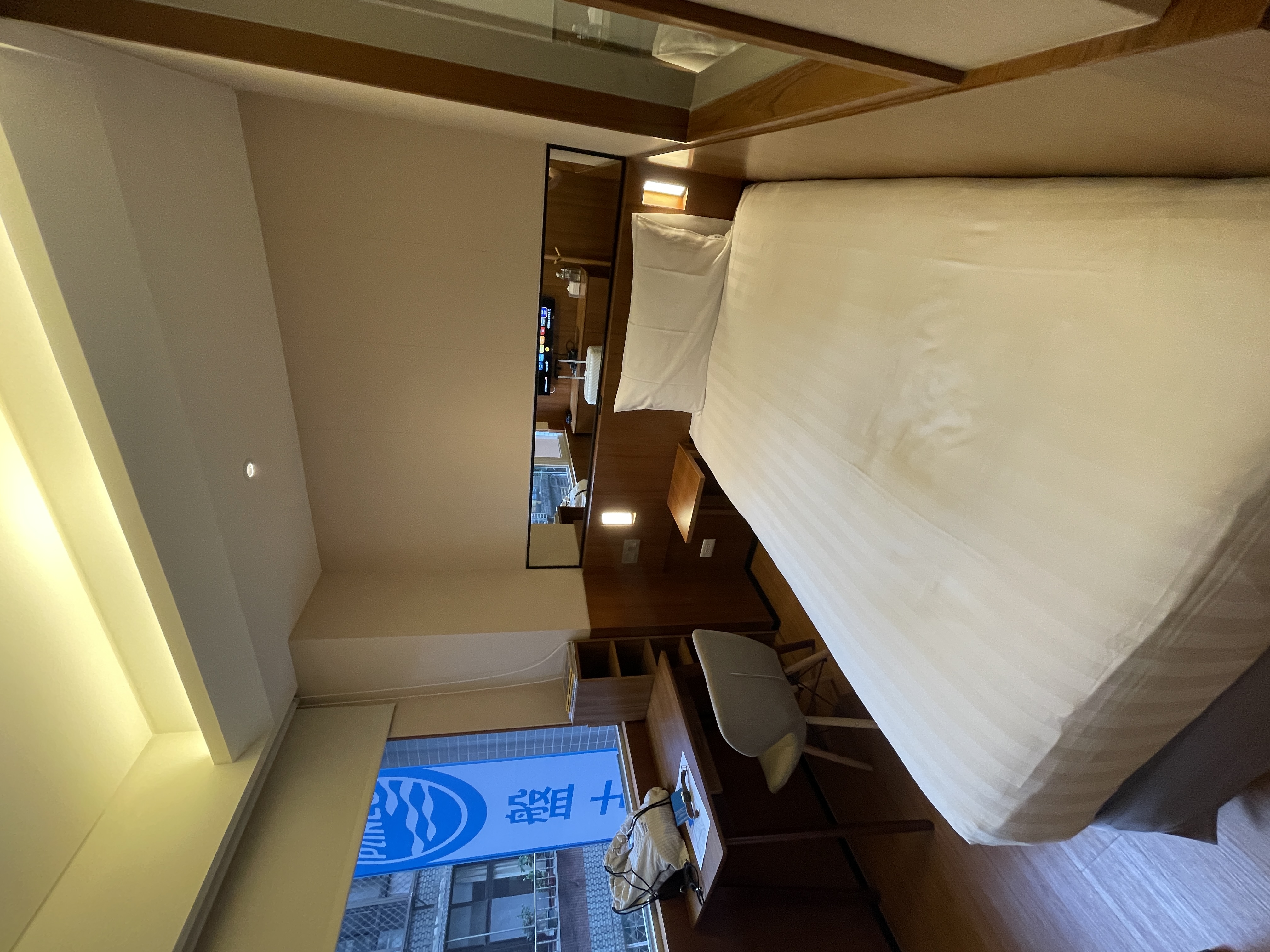
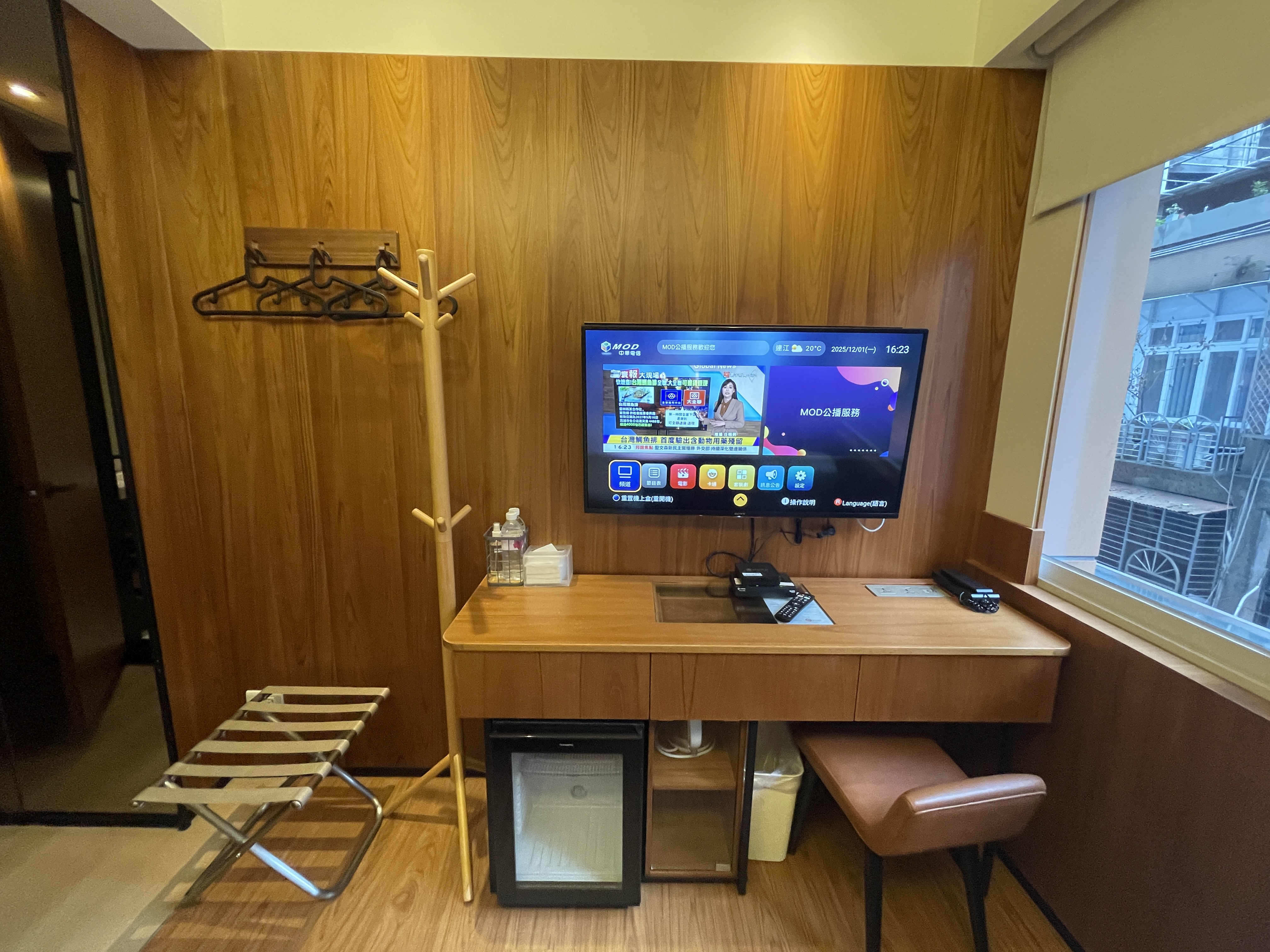
The room is compact. But compact does not mean compromised.
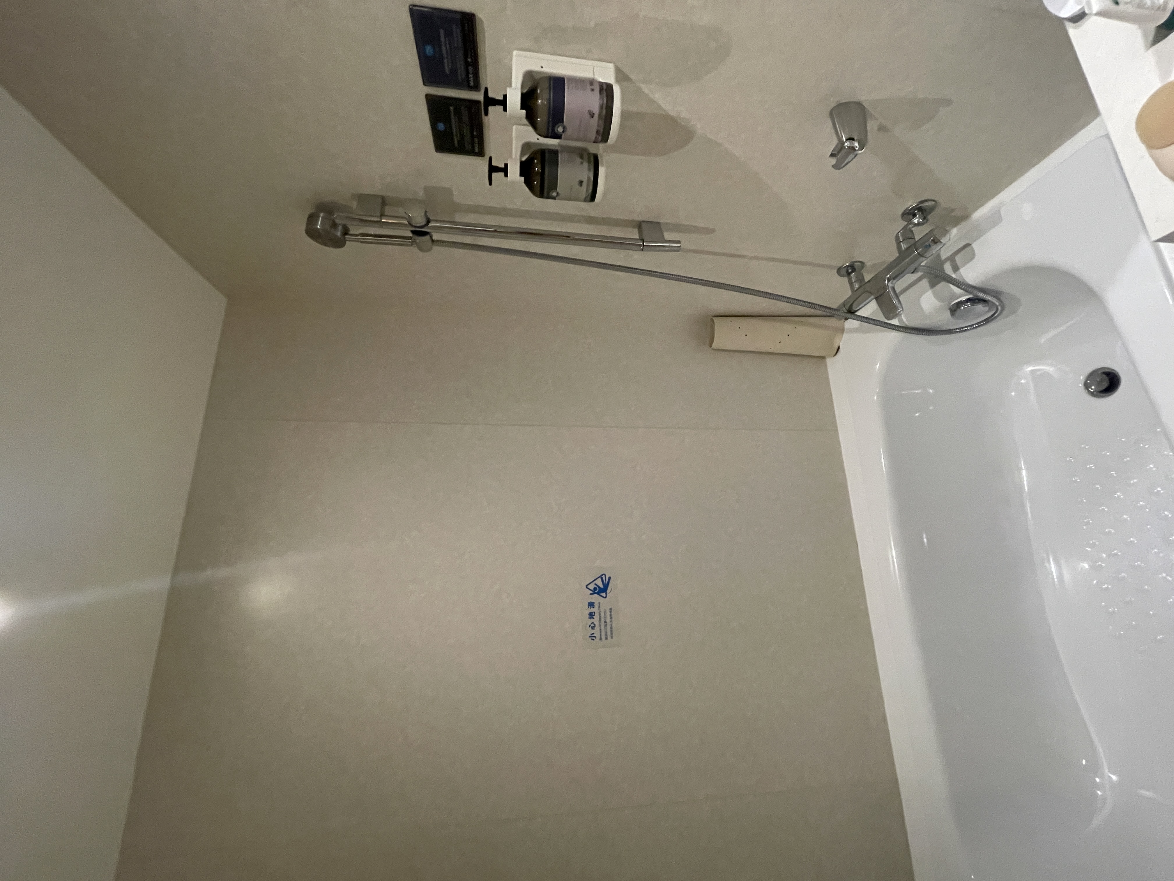
Everything needed is there — bed, desk, wardrobe, TV — each element allocated exactly the space it requires. Teak wood panels cover the walls, bringing warmth without weight. The room does not try to feel larger than it is. It simply feels right as it is.
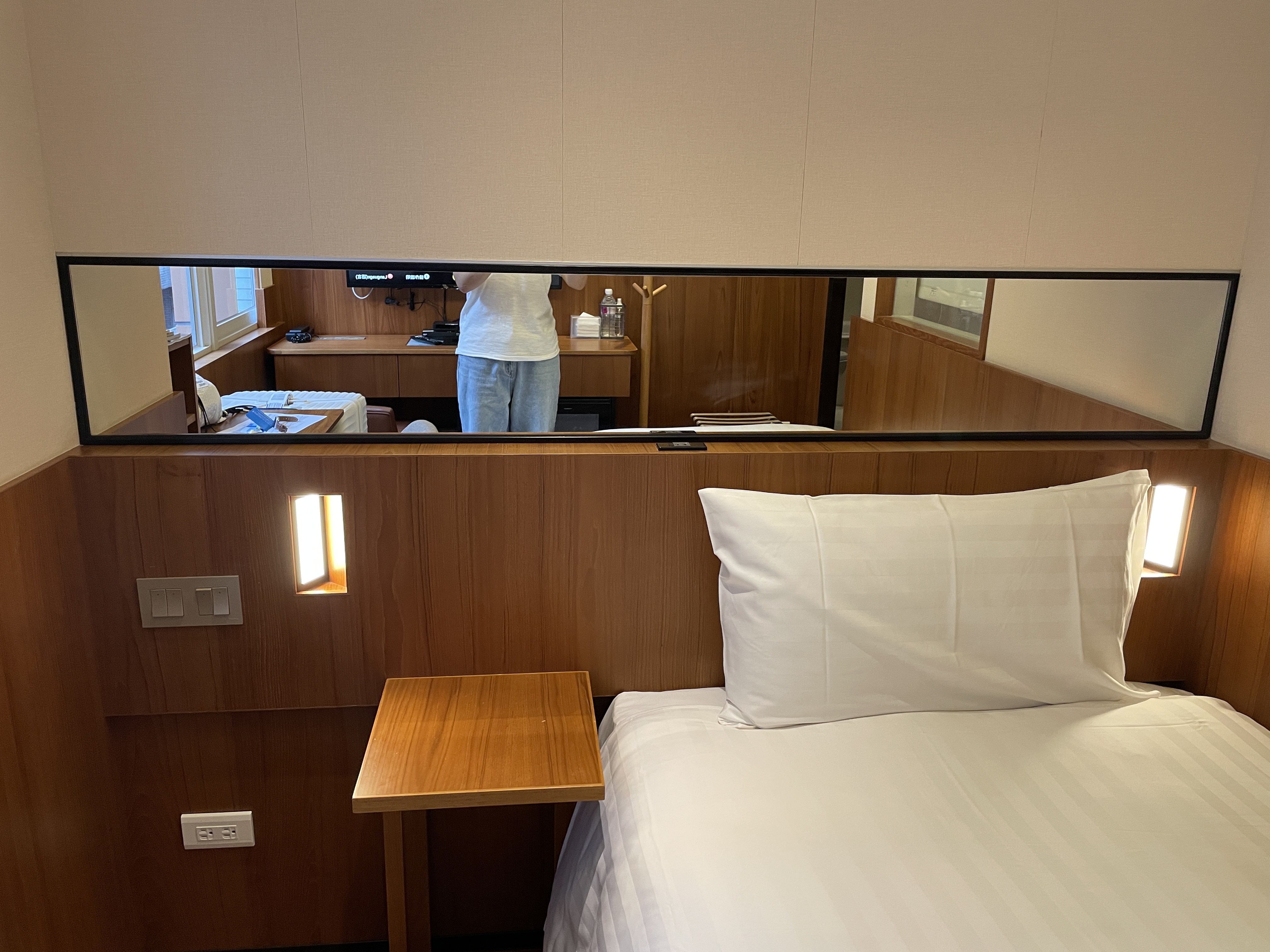
A long horizontal mirror above the bed extends the visual depth of the room. Reading sconces on either side — positioned symmetrically, no excess. The teak panels absorb the light and return it as warmth. This is not luxury by addition. It is quality by precision.
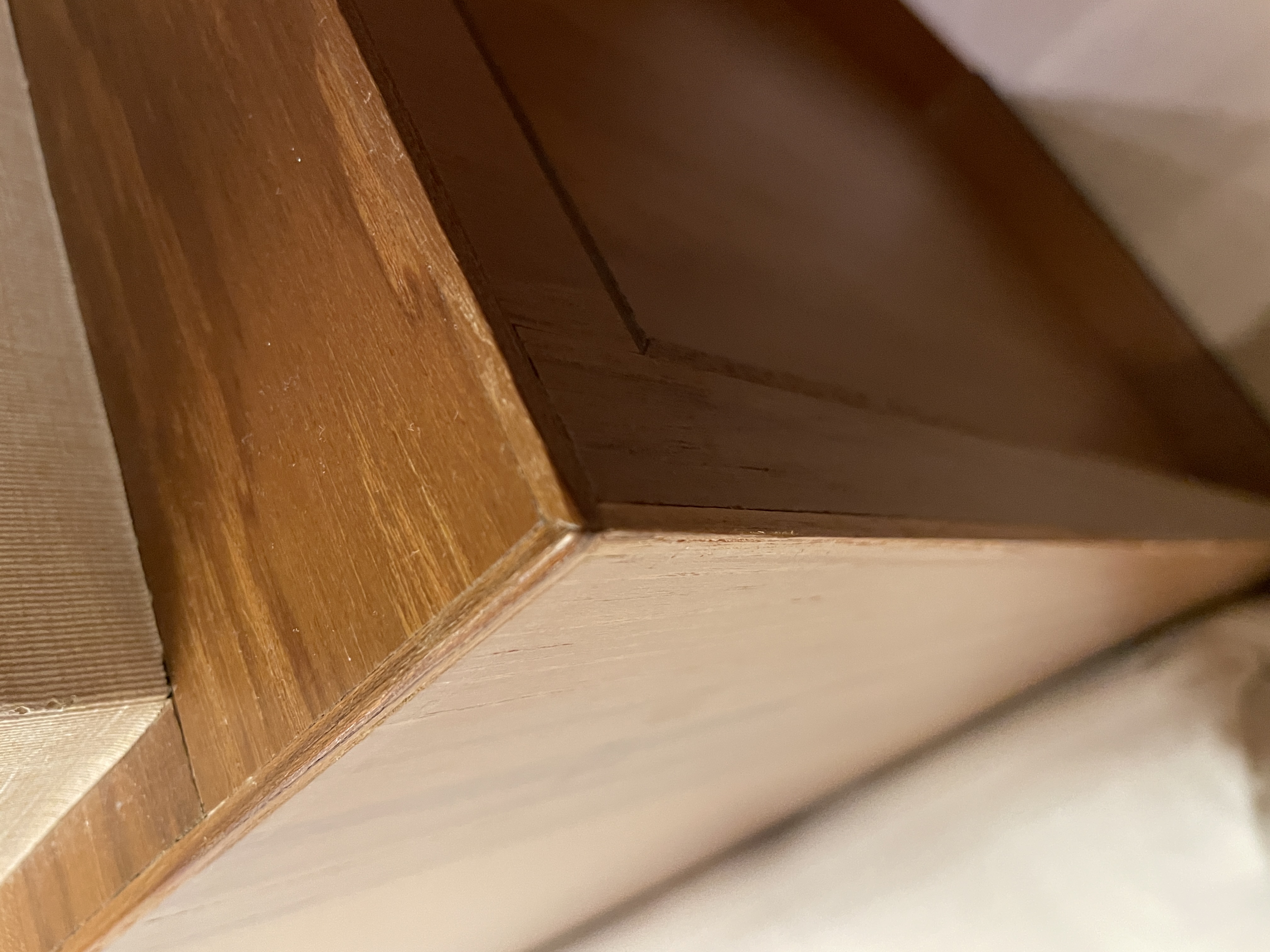
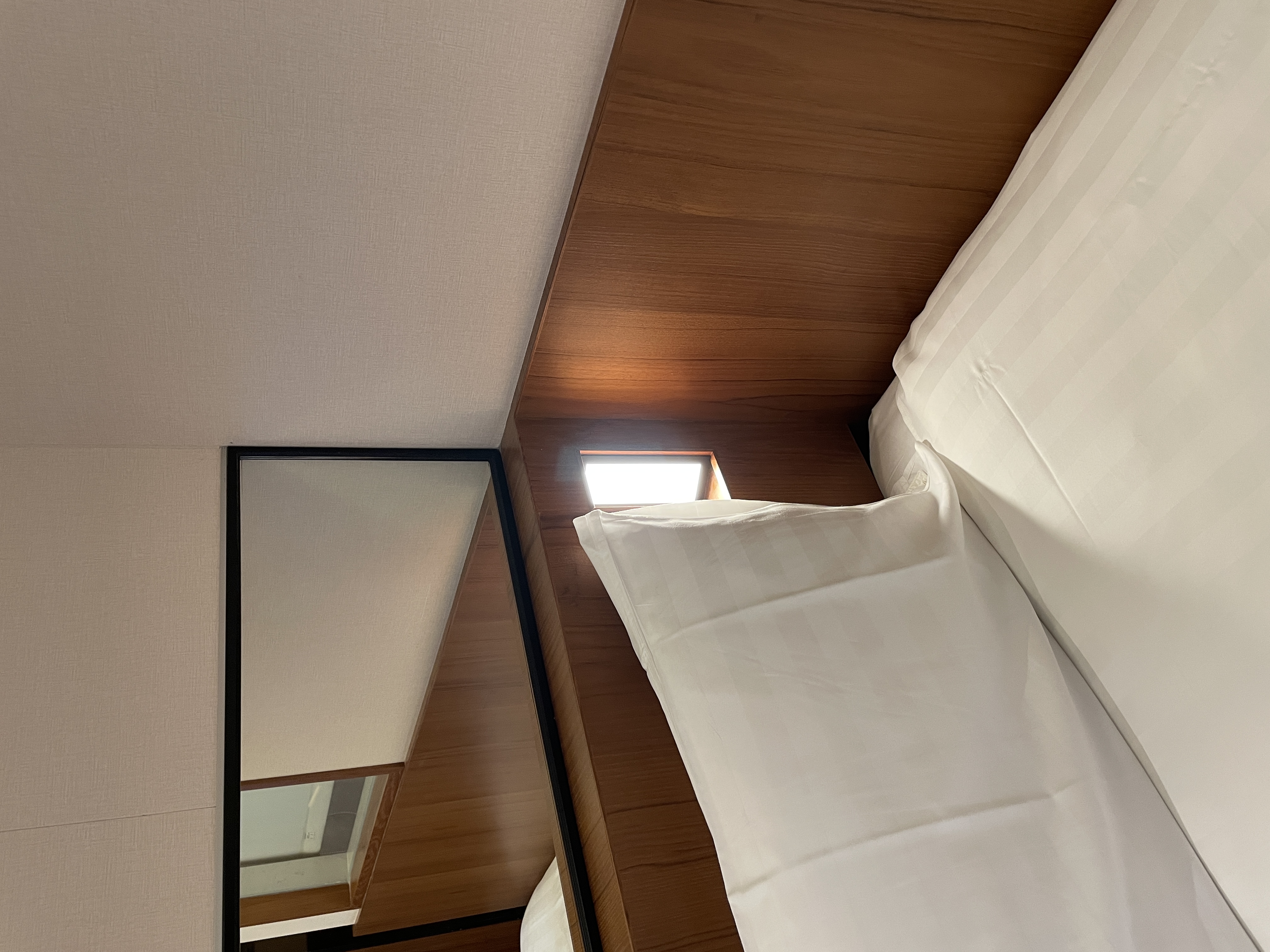
Every wooden panel in this room ends with a 45-degree beveled edge — a chamfer finish. It is not visible at first glance. You notice it only when you look closely.
That is the point. Details that reveal themselves slowly are the ones that build lasting impressions. A chamfer takes more time and more skill to execute. No one does it unless they mean to. At PANCO, they meant to.
the longer it stays in your memory.
PANCO knows this.
PANCO Hotel is not trying to be spectacular. It is trying to be remembered.
The cobalt blue facade is a brand decision executed at architectural scale. The heritage lobby interior is a cultural positioning. The chamfer detail in the guest room is a proof of craft. Each layer — exterior, lobby, corridor, room — reinforces the same message: this place was made with intention.
The contrast between the modern exterior and the heritage interior is not a contradiction. It is the strategy. Spaces that surprise you on the inside stay with you far longer than spaces that only look impressive from the outside.