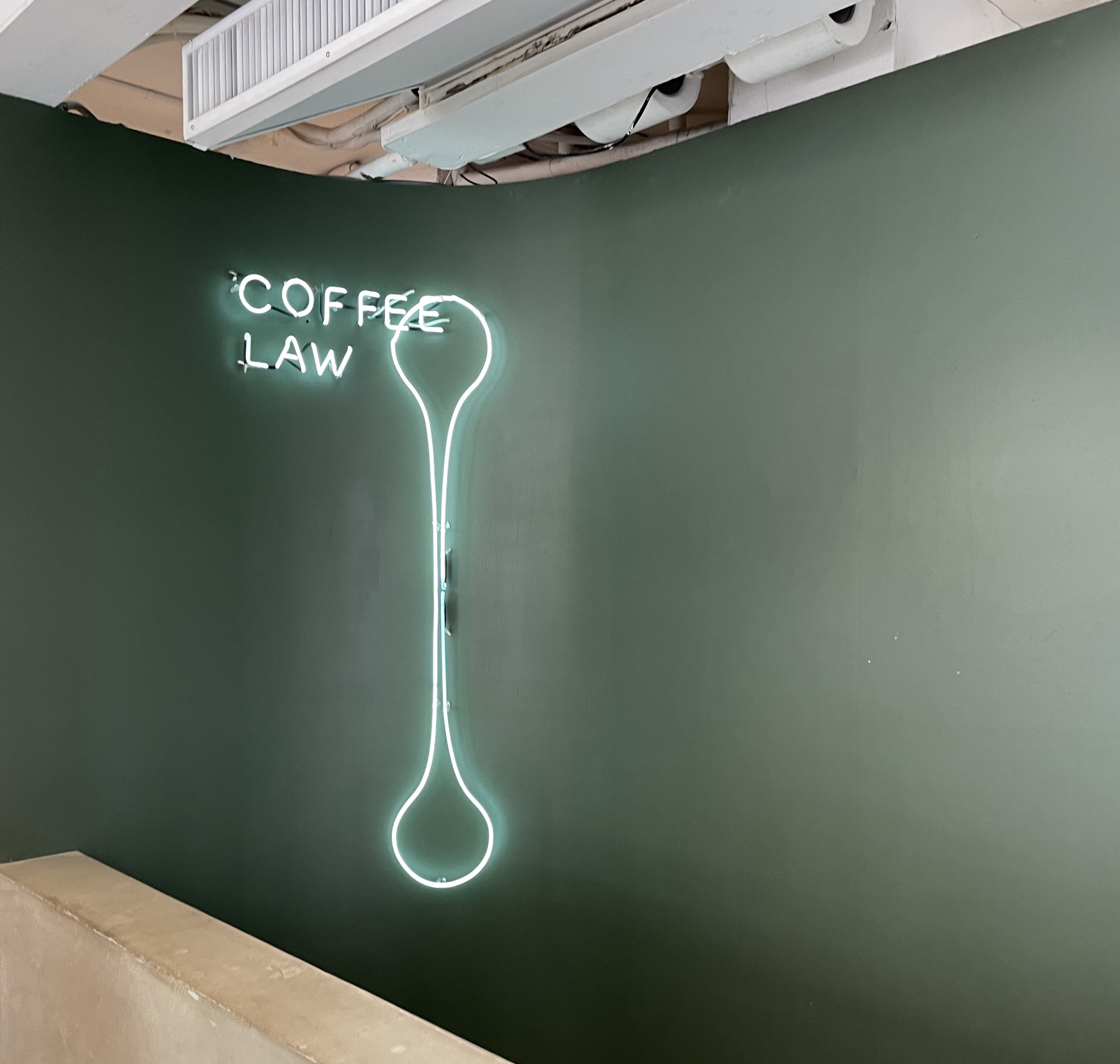
The wall at the entrance is a deep olive green. A neon sign hangs against it — the silhouette of a spoon, with the words COFFEE LAW running vertically beside it.
It is not a complicated brand statement. It is a tool. The object that touches coffee every day becomes the face of the brand. Precise, practical, and immediately readable.
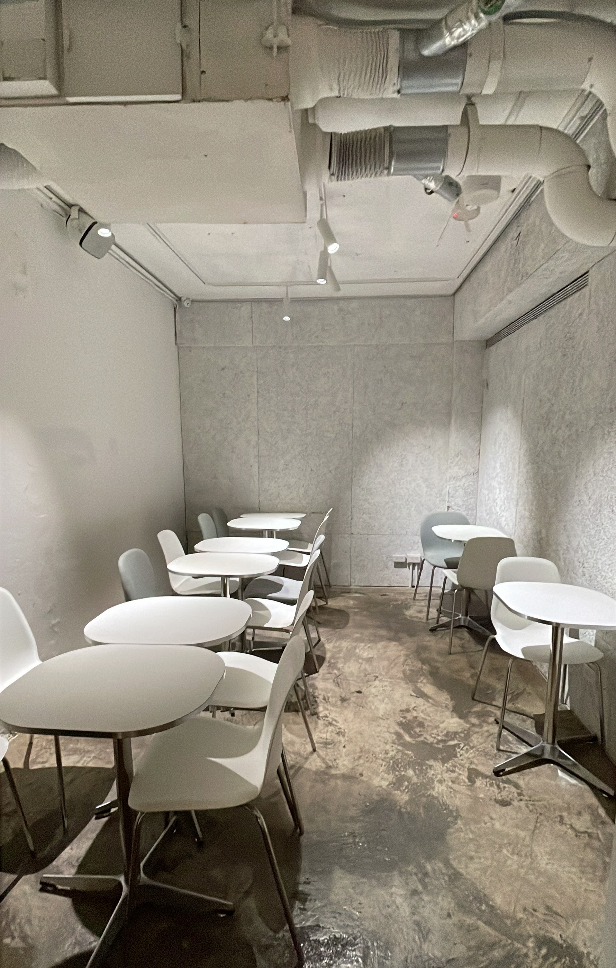
The ground floor is raw. Concrete bar tables run along the window. The chairs are hard and cold. Nothing softens the material.
The basement operates on a different logic entirely.
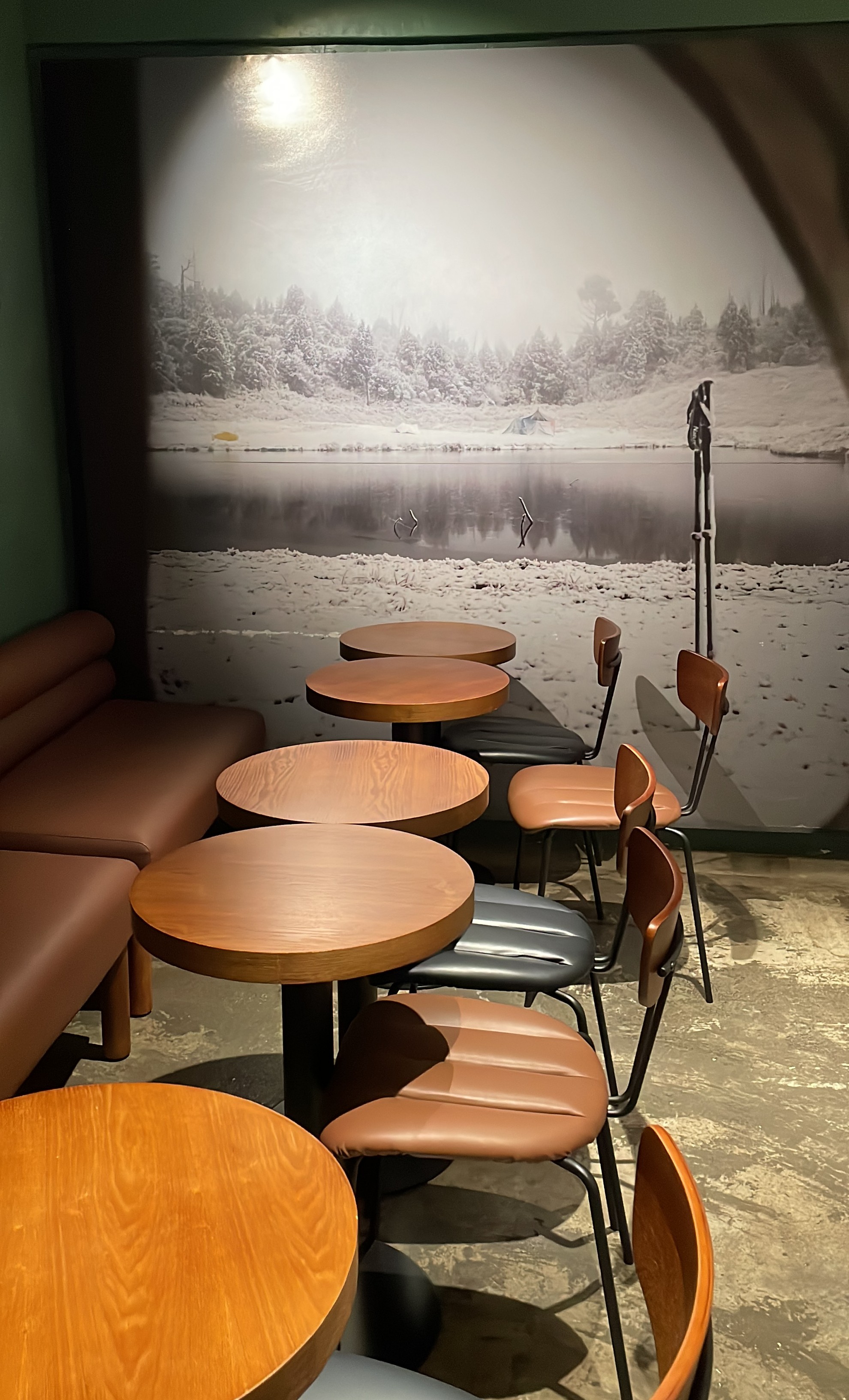
Dark olive green walls. Camel leather booth sofas. Mushroom-shaped pendant lights casting warmth from above. Spotlights fall onto individual tables — each seat lit like a stage. A large black-and-white photograph on the wall. You do not feel like a café customer here. You feel like the main character of something.
Green, camel, solid wood, monochrome. The combination is richer than it sounds.
Move further in and the atmosphere shifts again.
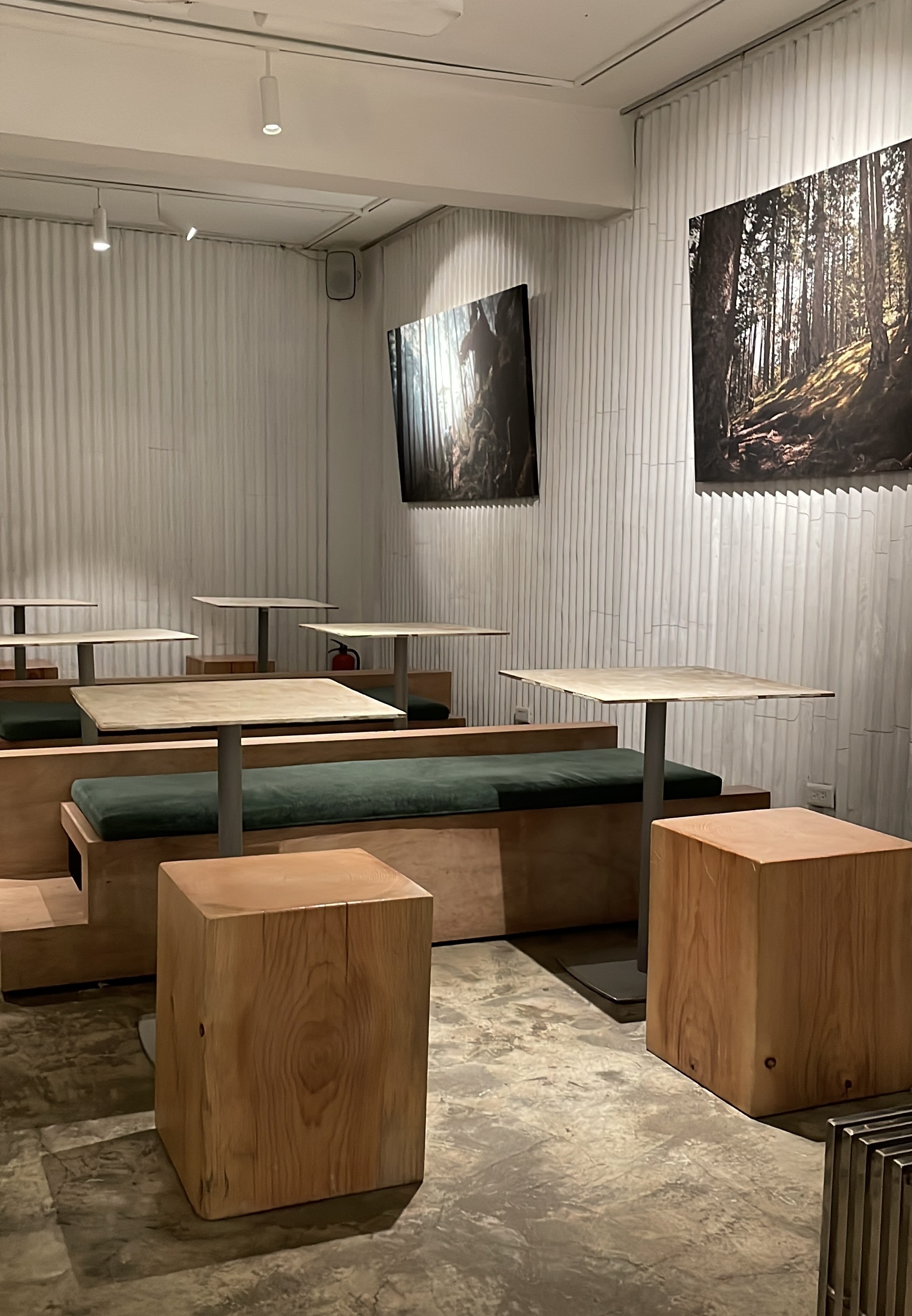
A long dark green velvet bench cushion runs along the wall. Pale oak cube stools in front. Framed artwork on the wall. The zone reads like a gallery — quiet, composed, contained.
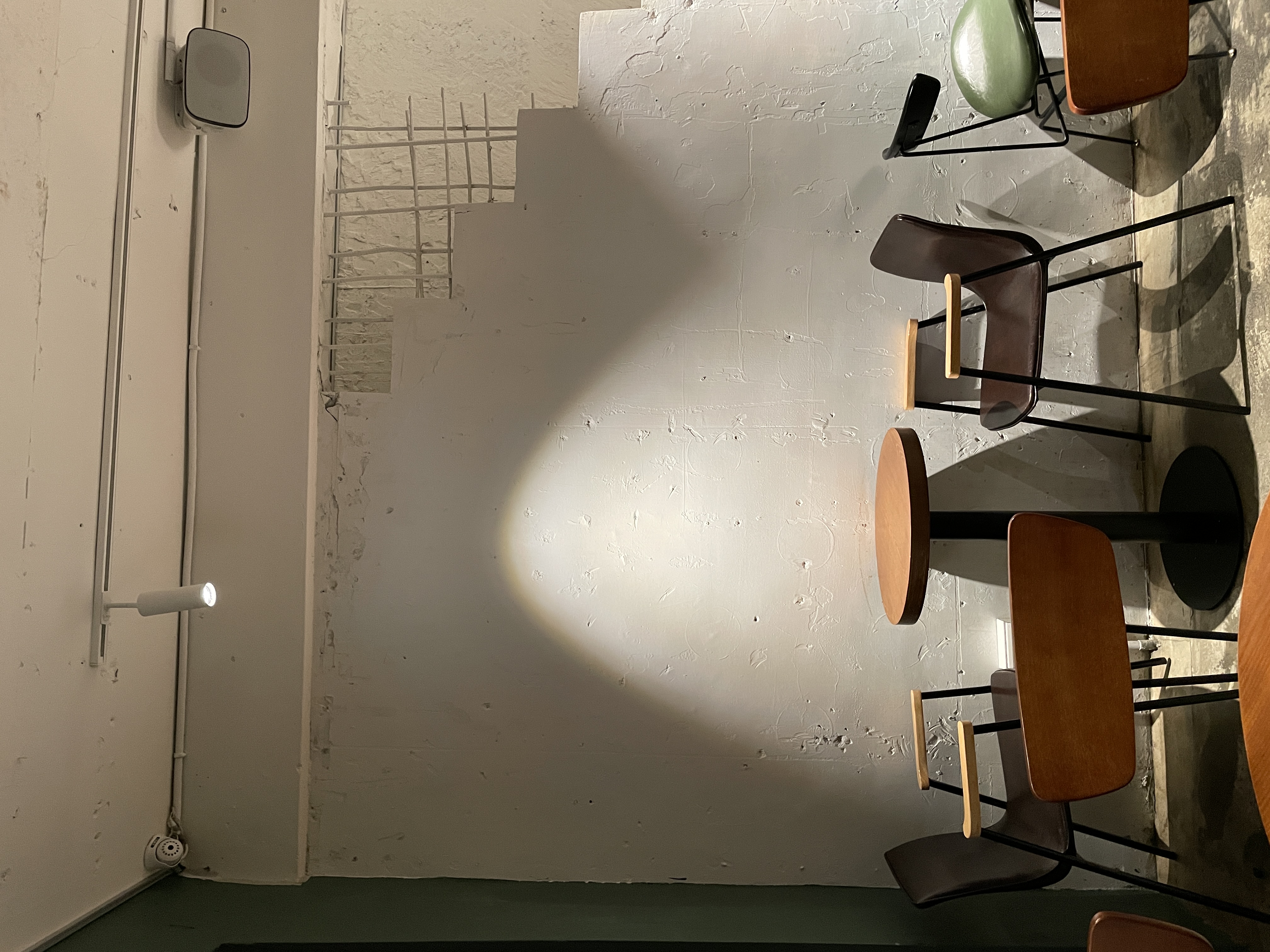
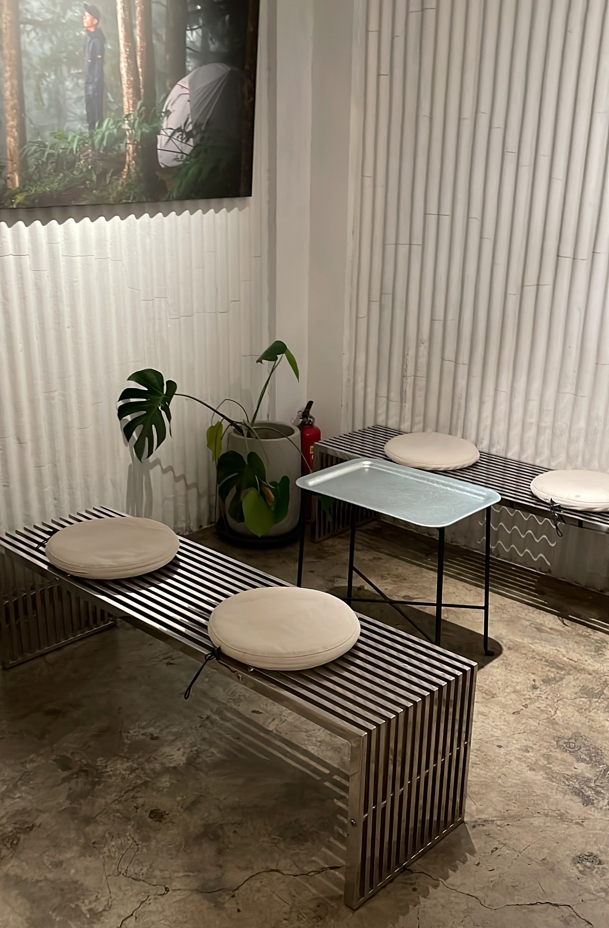
Then another shift: horizontal steel slat benches, white cushion stools, a single plant. Cold again. Stripped back. The warmth of camel and wood from a few steps ago is gone.
The basement cycles through temperature — warm, cold, warm, cold — and every zone feels intentional.
The space gives customers the power to choose their own temperature.
The basement does not have one mood. It has several — and that is the strategy.
Some days you need focus. Some days you need a quiet corner. Some days you want to feel seen. Coffee Law has a zone for each of those days. The lighting shifts, the materials shift, the social energy shifts.
What looks like an eclectic design choice is actually a service decision: giving guests the ability to self-select their experience before they even sit down.
Everything in this space traces back to two colors: grey and green.
Grey comes from the concrete and steel — the bar tables, the exposed ceiling, the chair frames. It is the skeleton of the space. Green layers on top: the walls, the sofas, the cushions, the neon sign. It moves through every zone without calling attention to itself.
Cold material. One repeating color. That is the brand identity — not stated, but built into every surface.
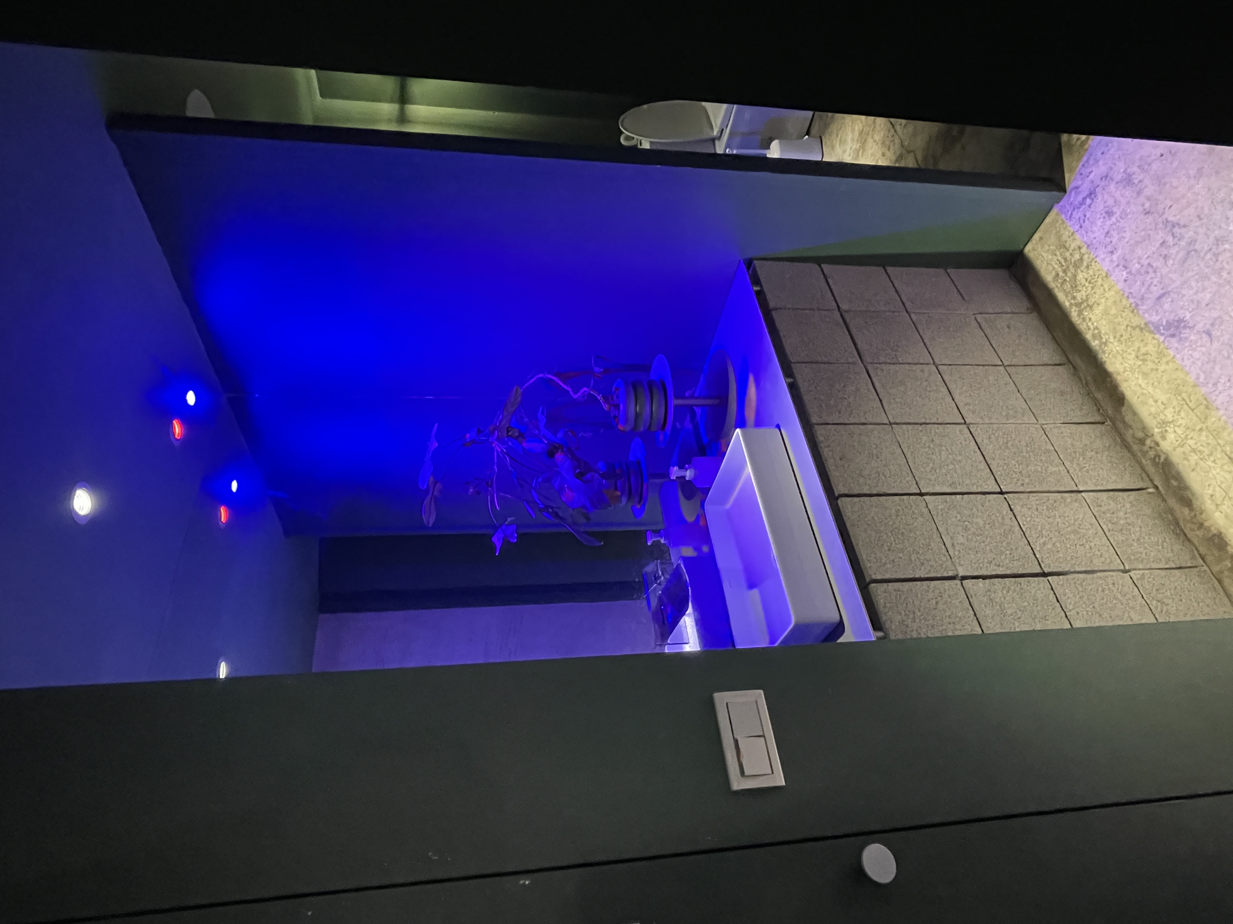
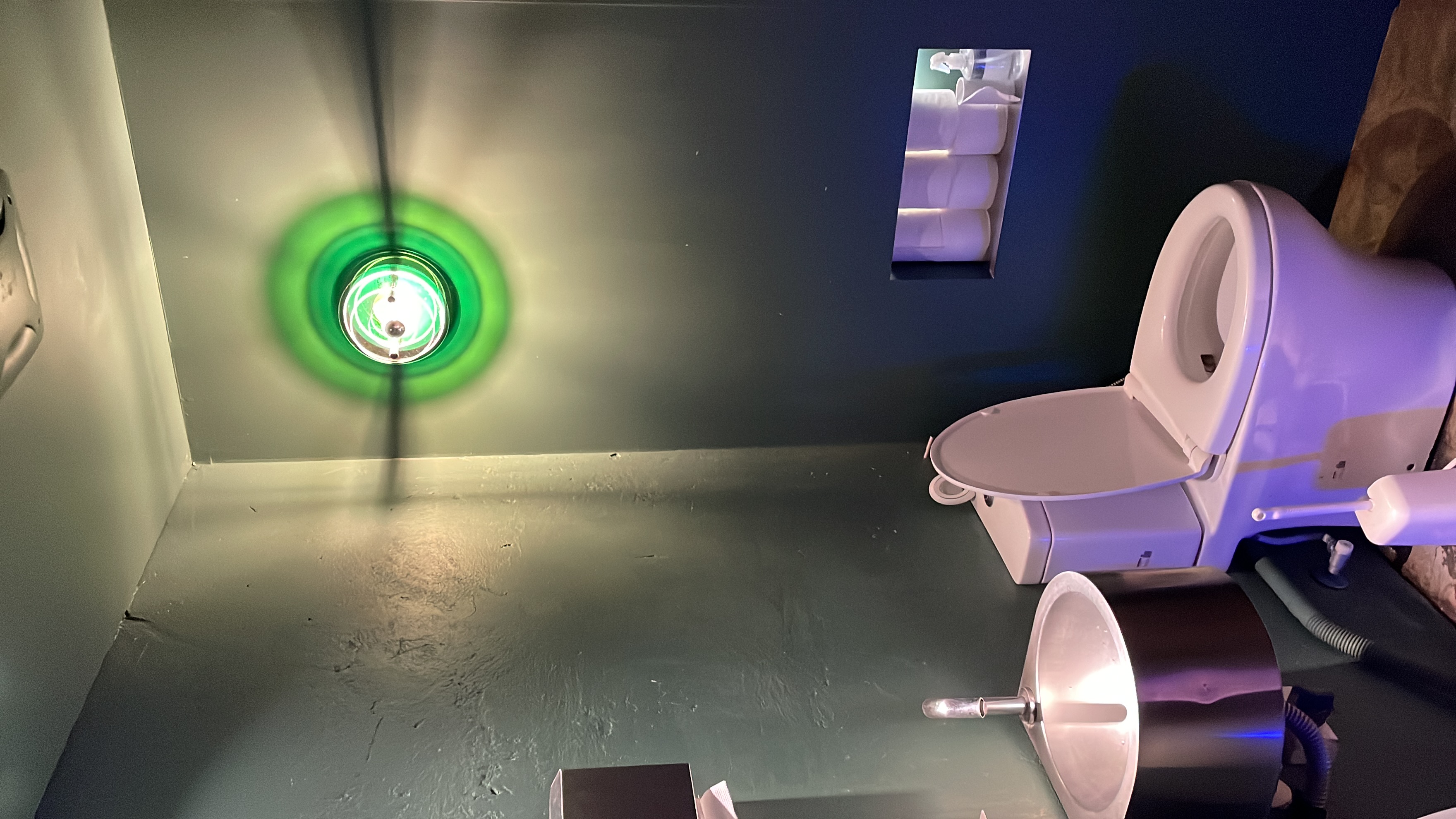
Blue light at the restroom entrance. Green light inside. The principle that governs the entire café — light marks every transition — continues here, in the space most designers stop caring about.
That is the tell. When the brand logic extends into the restroom, the design is not decorative. It is structural.
Coffee Law is not built on expensive materials. The concrete is raw. The chairs are simple. The ceiling is exposed. What makes the space memorable is none of that.
It is the consistency of the language. The zones feel different, but they all speak the same grammar: grey as structure, green as brand, light as divider, choice as service.
Before choosing furniture, choose what your space is going to say. Coffee Law chose its language first — and built everything around it. That is spatial branding.