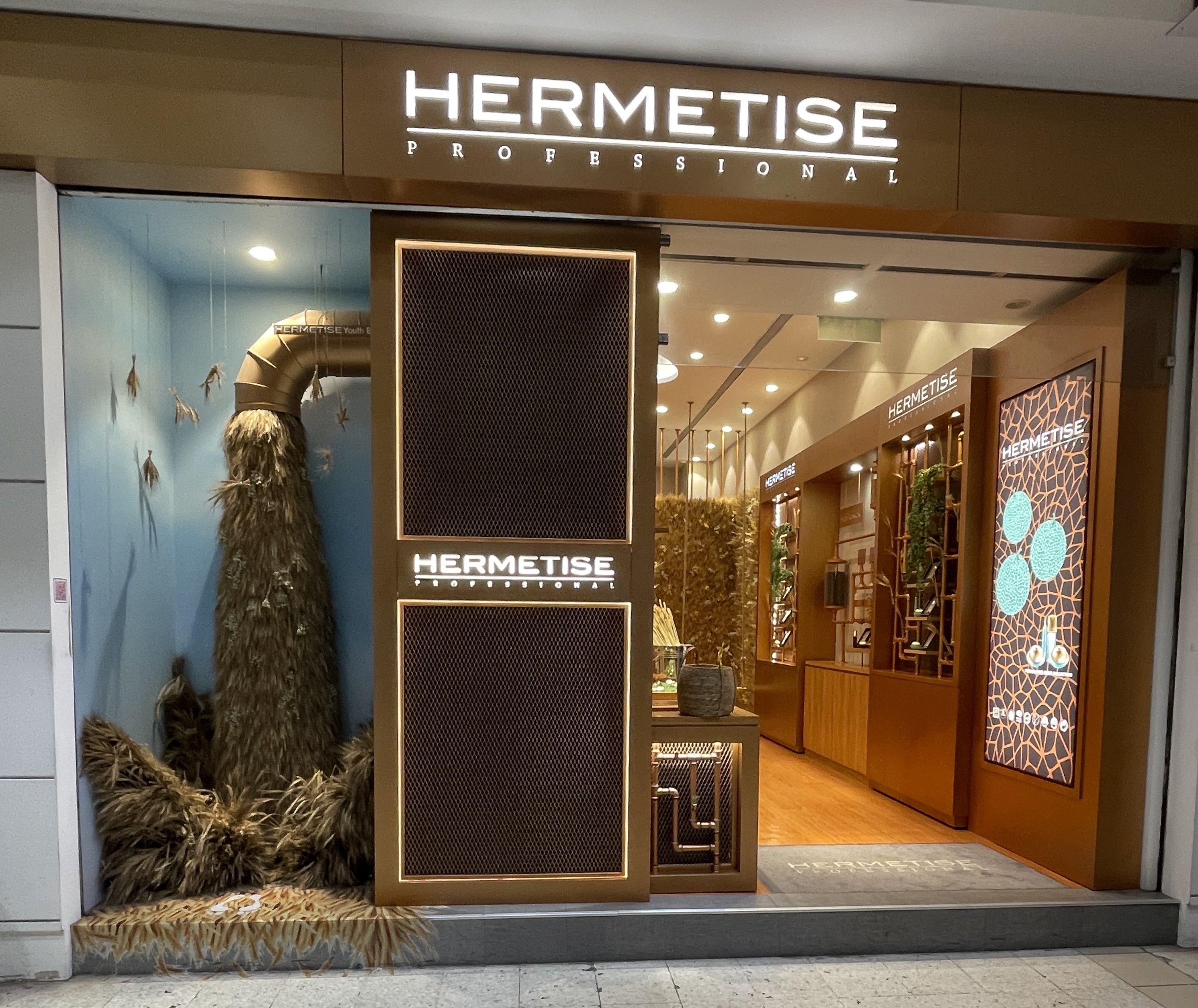
You stop walking.
There's nothing in the window.
This is a skincare brand.
No serums. No creams. No displays.
Instead:
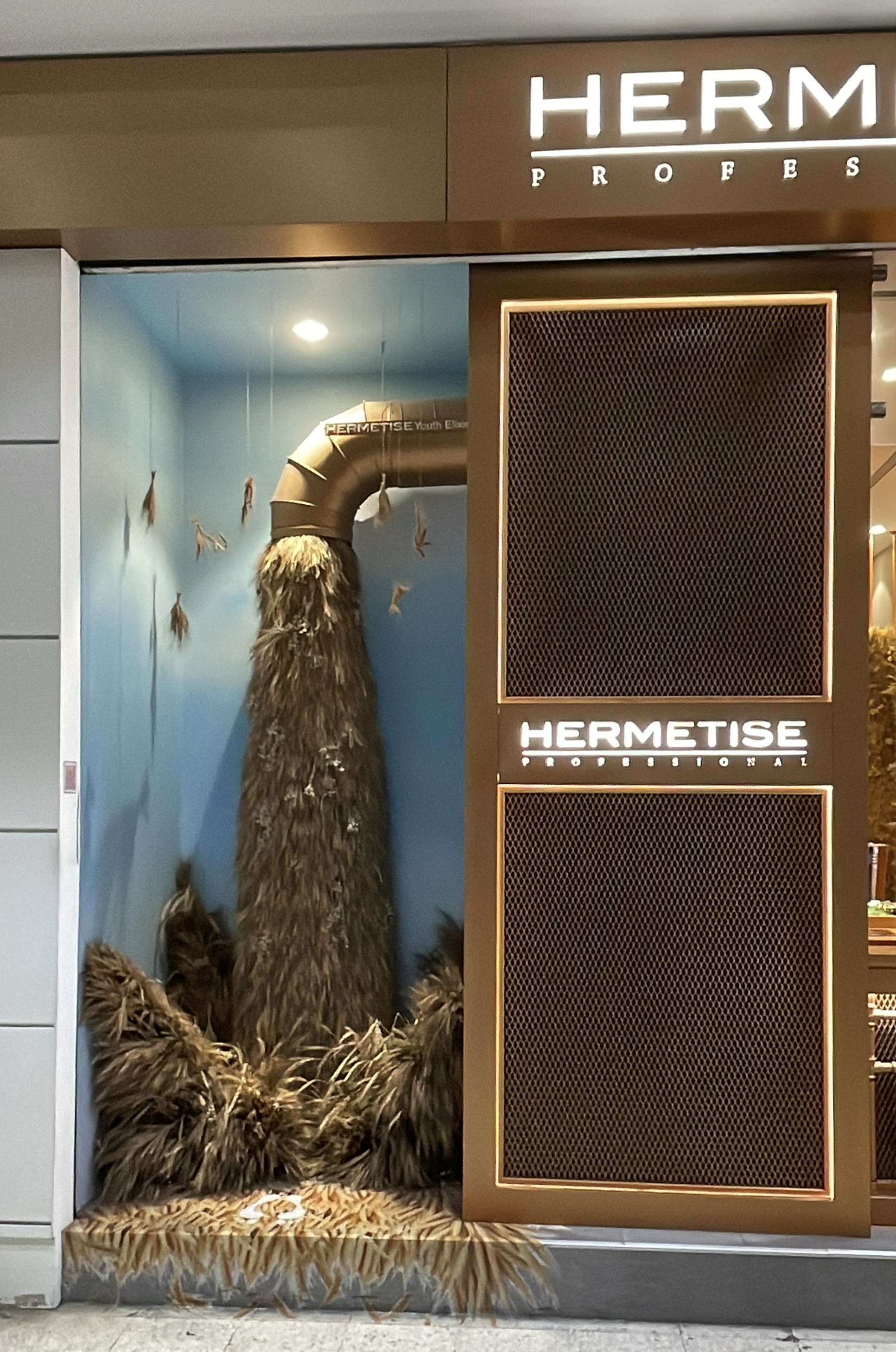
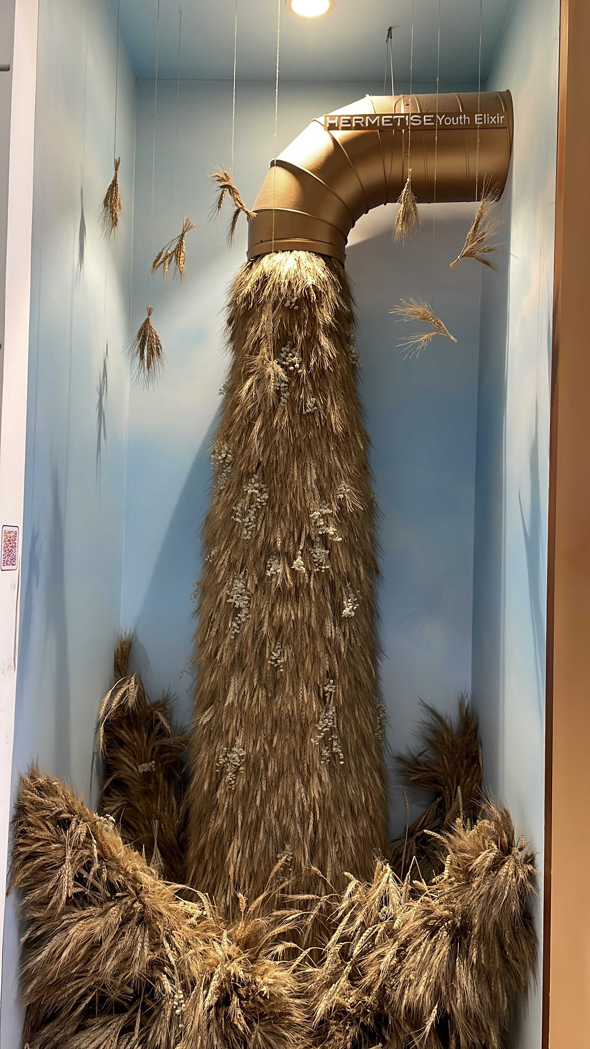
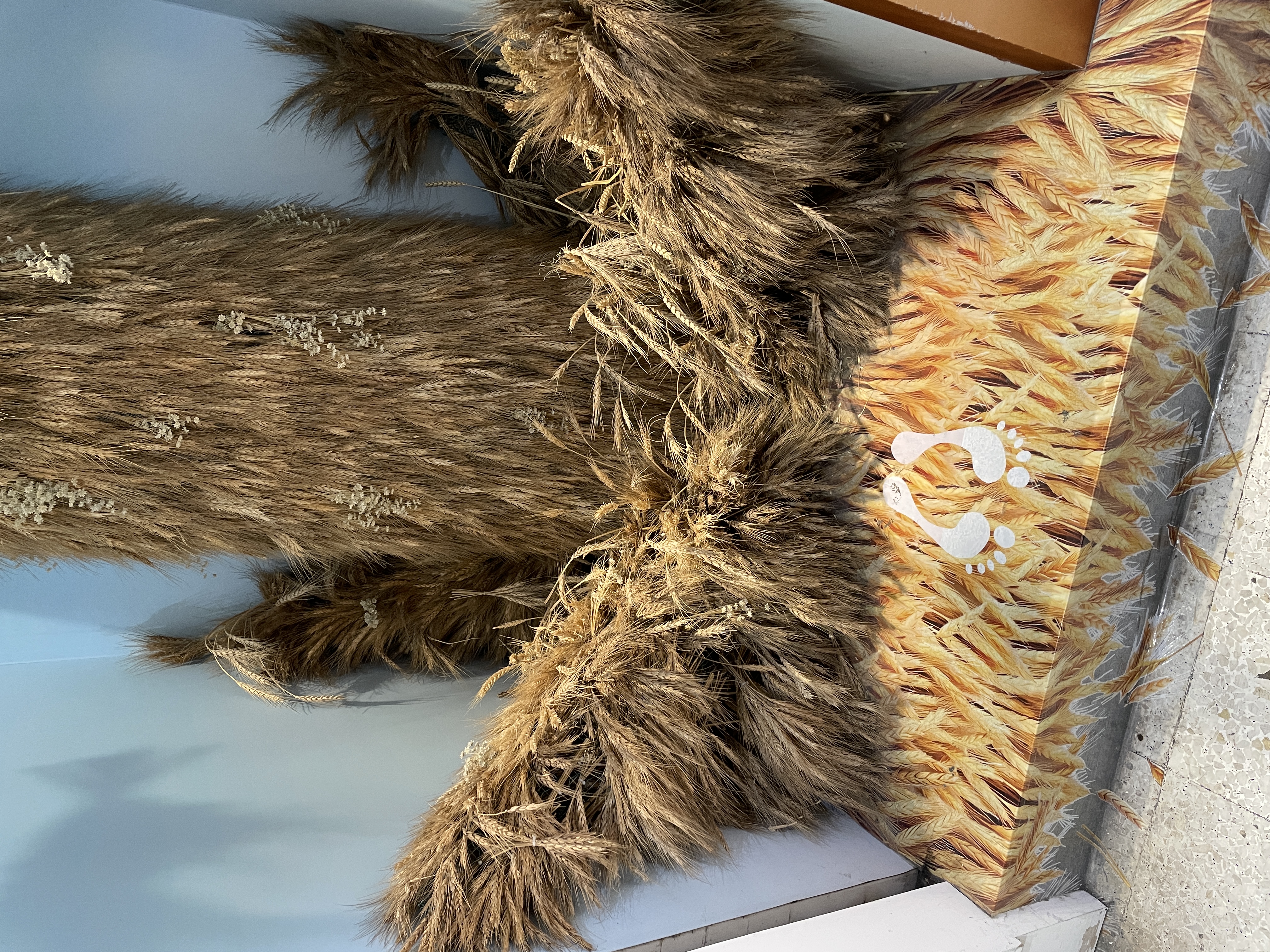
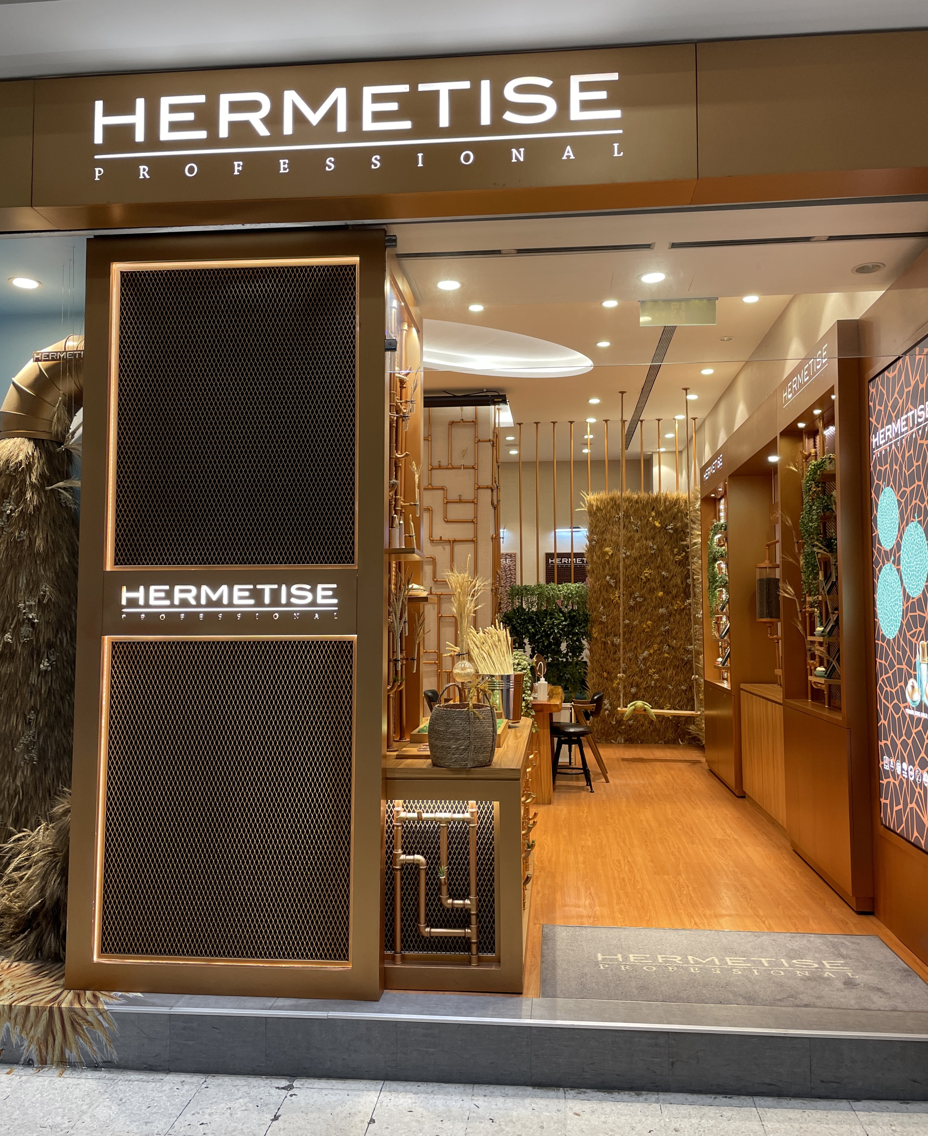
Dry wheat stalks cascading from ceiling to floor.
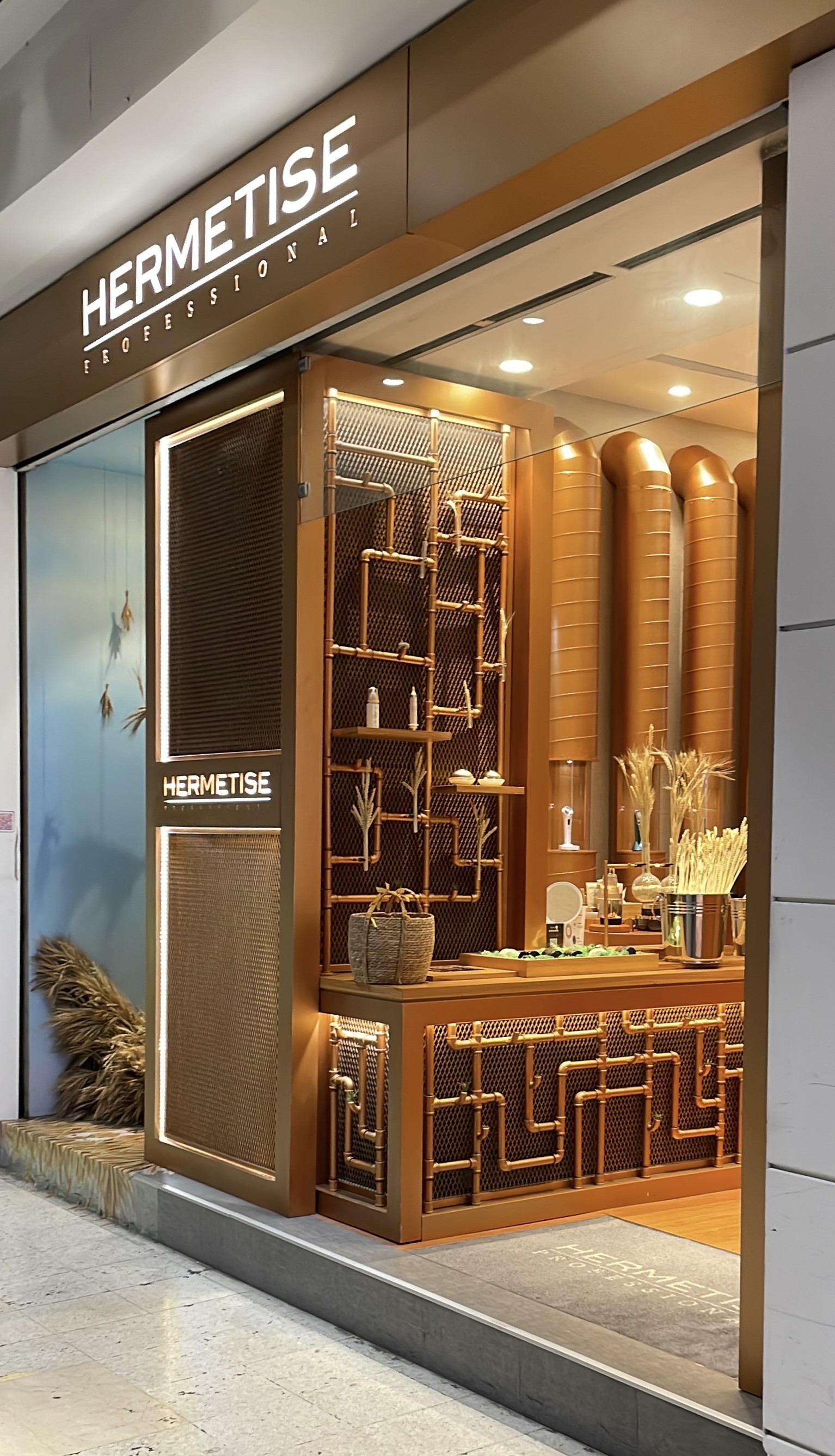
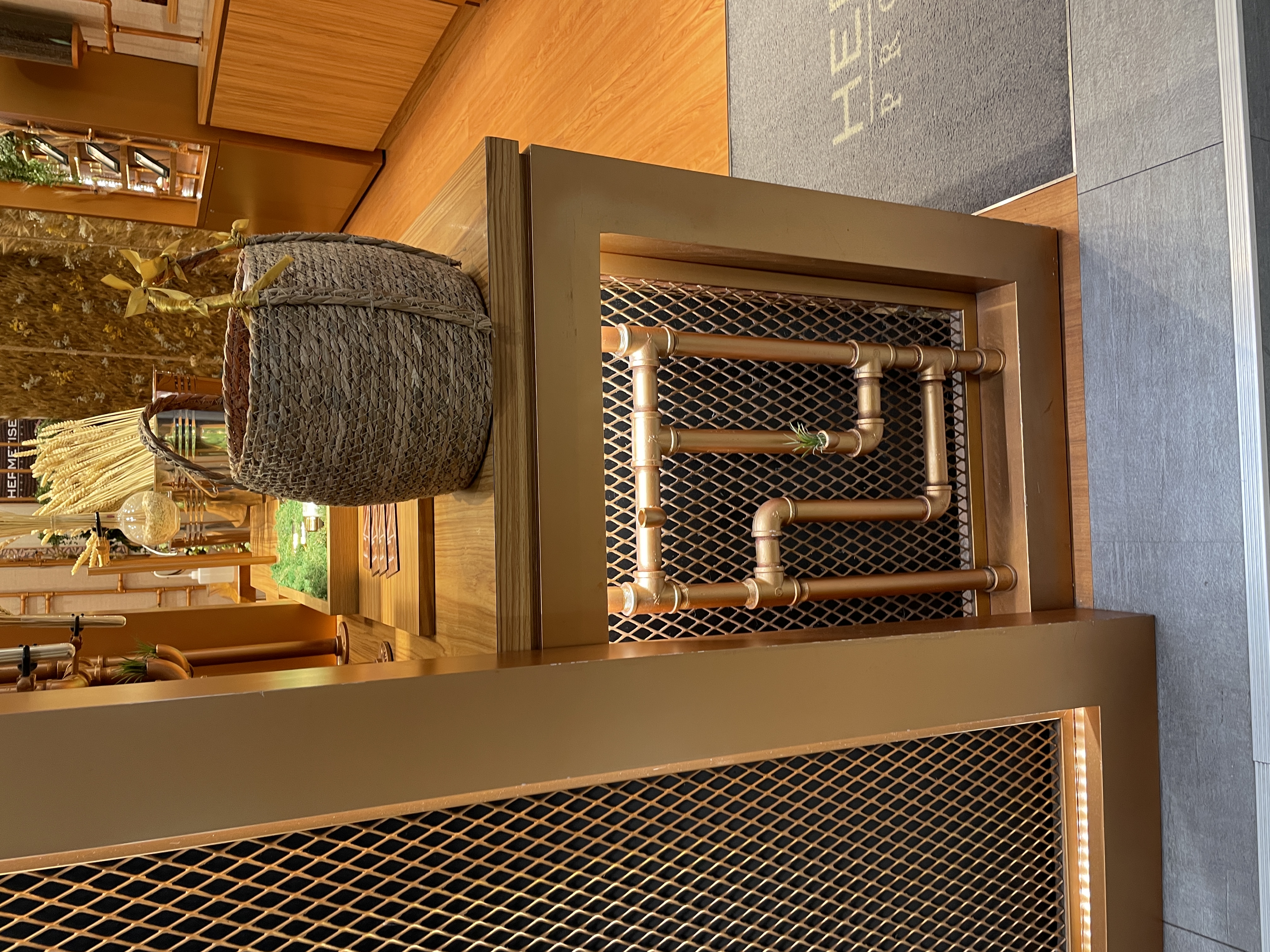
Thick copper pipes crossing the wall.
A metal mesh panel blocking the view from outside.
At first, you don't know what they sell.
That's exactly the point.
Read each element separately and they mean nothing.
Read them together and the logic appears.
Wheat stalks: raw material harvested from nature.
Copper pipes: the apparatus that processes it.
Metal mesh: the filtration layer — refinement made visible.
HERMETISE makes plant-extract skincare.
The production process — harvest, process, refine — is exactly what the window shows.
Not a product display. A process display.

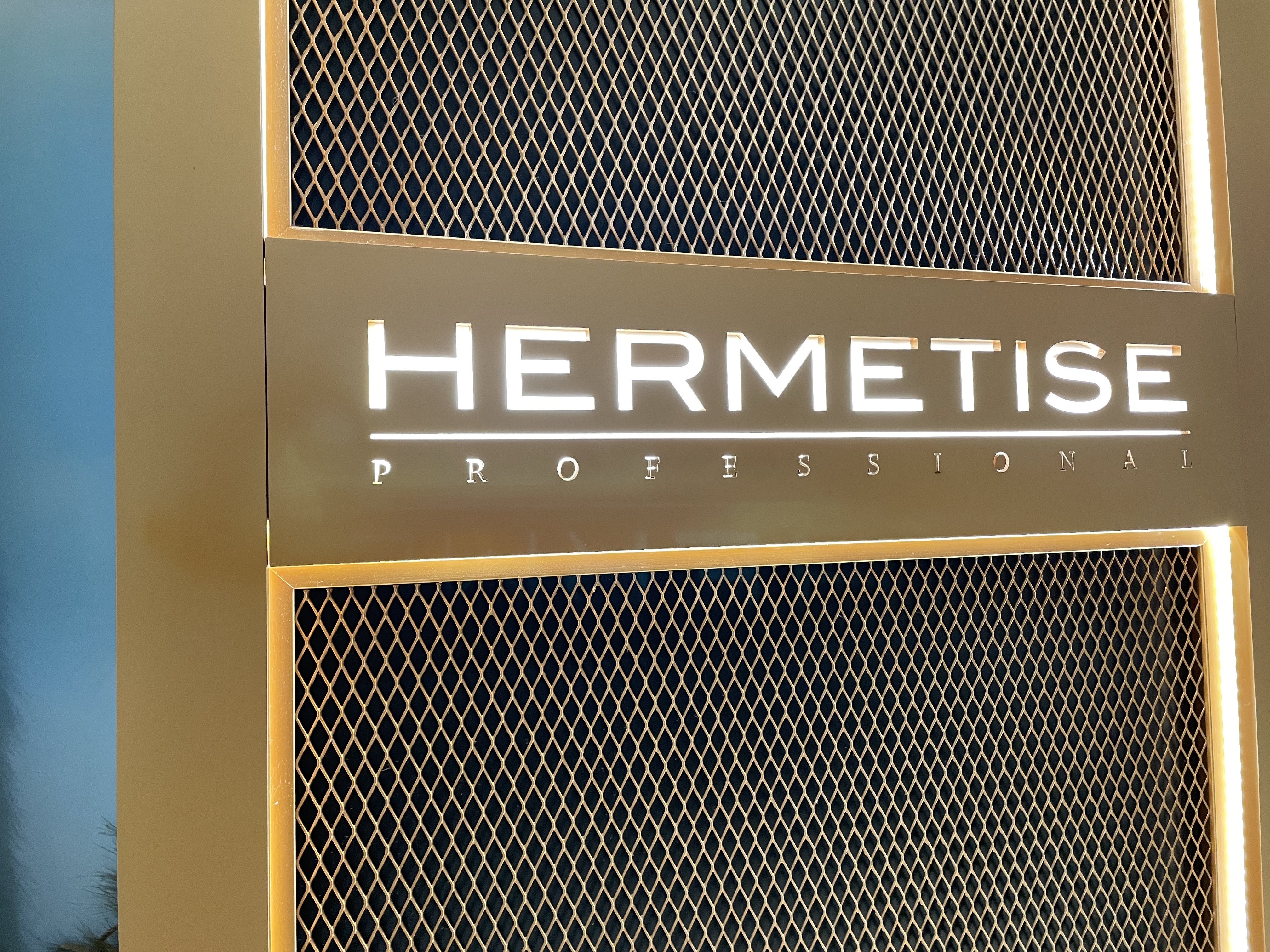
HERMETISE.
The name comes from Hermetic Alchemy — the ancient practice of refining raw materials into an elixir of youth.
Their tagline: "Formulate your exclusive Youth Elixir."
The brand's logic: just as an alchemist distills raw matter into something transformative,
HERMETISE processes plant extracts into anti-aging skincare.
So the window looks like an alchemist's laboratory.
Because it is one.
The name built the space.
Or the space is explaining the name.
Cross the threshold and the register shifts.
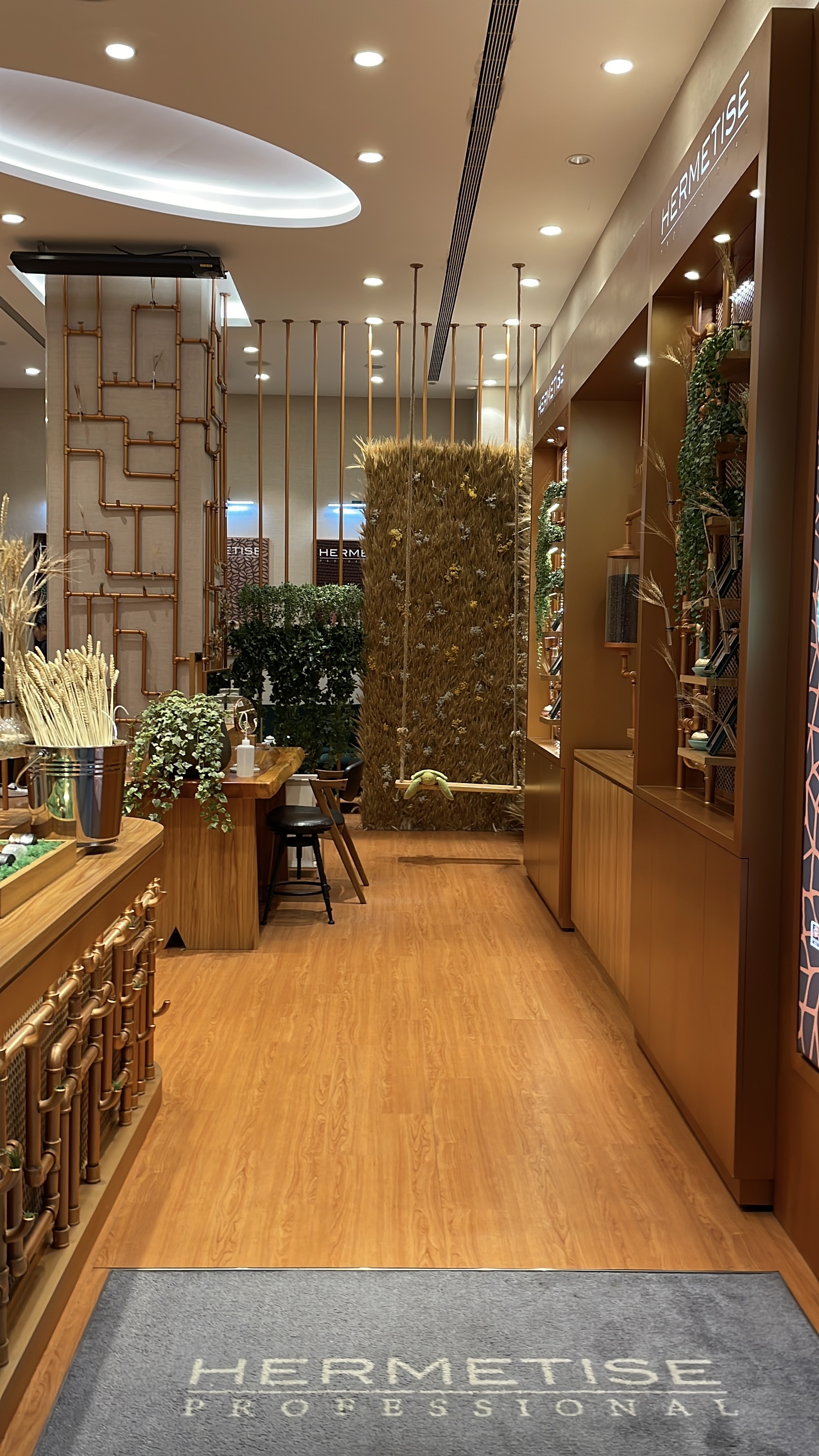
The cold, industrial rawness of the exterior gives way to something warmer.
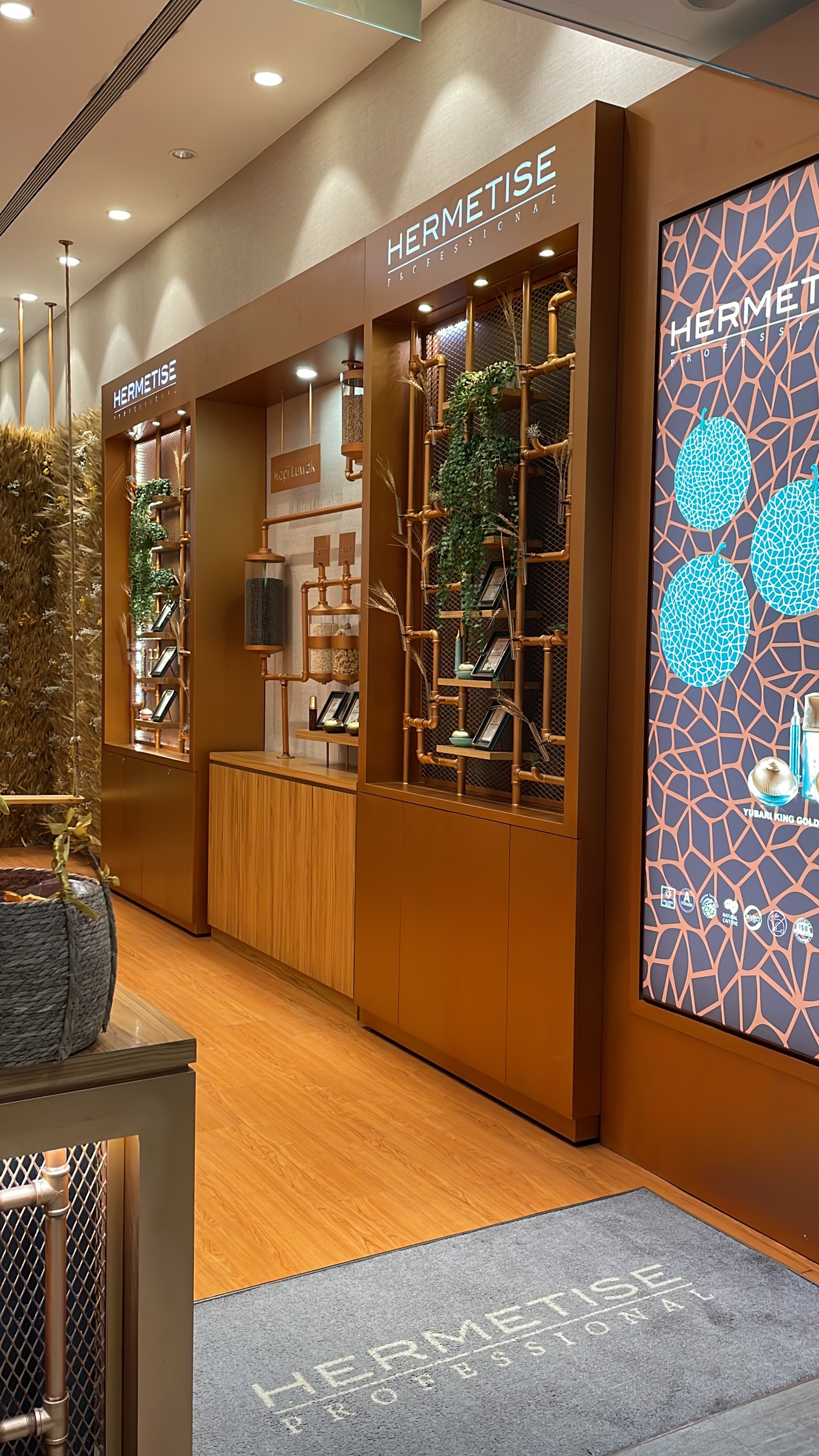
Brass-toned wooden shelving runs along the walls.
Products sit on pipe-frame display units.
Recessed ceiling lights — warm 3000K — illuminate each item evenly.
The interior speaks the same language as the exterior.
Copper pipes have become shelf structures.
The brass tone continues — just refined.
Outside was the laboratory.
Inside is the result.
Most beauty retail spaces lead with product.
New launch at the front. Promotional banners. Staff approaching immediately.
This space leads with belief.
The window shows the alchemist's workshop.
The signage implies the brand's name and origin.
Only then — after you've absorbed all of that — do you reach the products.
The sequence matters.
By the time you see a single item on a shelf,
you've already been convinced.
That's not interior design. That's brand sequencing.